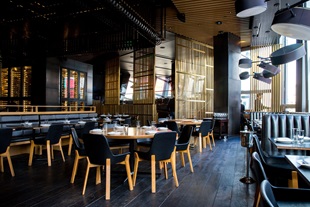
Hospitality web design: essential UX tweaks for a better online booking experience
Hospitality web design
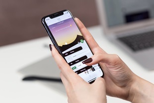
Sometimes even a minor UX tweak will make a significant change for users. While much attention has been paid to eCommerce checkout pages, a hotel website’s reservation process is something that is not as frequently discussed. However, the rise of sharing economy (ie., AirBnb) and OTAs (ie., booking.com and Expedia) has brought a stiffer competition. One of the challenges facing hotel websites is to have a seamless online booking tool to compete against OTAs who are inherently adept at digital online experience.
From the Economist, Britain’s hotels are not completely hopeless in spite of the rising popularity of sharing economy and the related apps.
‘The impact of room-booking apps has been muted in London, says Marie Hickey of Savills, an estate agent. Only 0.5% of Londoners advertise their properties on Airbnb, compared with 2.4% of Parisians.’ The latest report by Citi Bank also indicates that the expansion of Airbnb listings in London and other major European cities has actually already slowed down’ (from the Economist). Well, that is a good news for hotels in the UK, as the demand (both holiday and business tourism) is not likely to slow down anytime soon.
Learning from the low-budget hotel websites
According to eConsultancy, the budget hotels top the list of hotel websites with the best user experience. To be more precise, Premier Inn and Travelodge are the top two hotels that offer easy online booking systems. (It is a sharp contrast to some high-end hotel websites such as Claridge’s who are lagging far behind in terms of search and online booking.)
When we break down into specific UX features that prompt users to take actions, then it is clear that budget hotel sites offer the most convenient and effective booking tools.
What about mid to high range hotels?
To understand how the process of searching and booking feels like for users, we conducted a small empirical research across several websites including DoubleTree by Hilton, Accor Hotels, Renaissance Hotel (Marriott hotel) and PH hotels, et al. And here are some key findings.
Lack of flexibility
If you are a frequent traveler, you might be familiar with how most airline websites let you choose flexible dates (+/- 3 days of your ideal departure date, for example). We think this should be replicated in hotel websites. Most websites assume that every user visit their websites with a clear dates in mind. But what if a user wants to compare the prices and availability between different dates? The lack of flexibility forces users to go back to the search box and then adjust the dates again and again. It is not only cumbersome but also time-consuming!
(DoubleTree is one of the few that let you pick flexible dates.)
Lack of reviews
Customer reviews and rating were prominent on the Renaissance Hotel’s and Doubletree’s website. While reviews have not been extensively used within the hotel businesses, other innovative booking sites such as booking.com have proven the vital roles customer reviews play in helping people book. (Yes, reviews and social media do help customers make up their minds!)
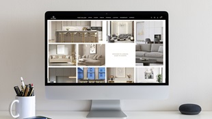
Lack of imagery
One of the most common problem I encountered with many hotel websites is the lack of room pictures. After I found the right room on AccorHotels, I was then redirected to ‘rooms and rates’ page where I expected to find out more about the specific room. But it was disappointing to find that the only picture shown was way too small, and we could only imagine what the bathroom would look like. In general, most hotel websites could use more large imagery to differentiate its brand from the rest.
Lack of efficient booking form
While almost every website have opted out some annoyingly long forms and terms & conditions, that doesn’t mean the current online booking process has completely removed the users’ pain points. One of the most significant potential UX tweaks include a booking form with many long drop down boxes. PH Hotel’s online form is not particularly off-putting. However, its booking form contains a long drop-down which should be replaced with a simpler and more efficient radio button form. In short, booking forms should focus on the key information, instead of overloading users with too much (and irrelevant) information.
(And the list goes on with Sergeant, SqLdr, WgCdr, SSgt, MSgt, Lt, LtCol, Flt Lt, Gp Capt, Bishop HisExcellency, HerExcellency, Mr & Miss, Rbbi, Pastor, Sheriff.)
Appnova is a digital agency specialising in web design, UX, eCommerce, mobile app development, branding, content marketing and social media.
Keep following us on Twitter @appnova and “like” us on Facebook for useful news and tasteful digressions about geeky stuff.


.jpg?mw=310)


.jpg?mw=310)


![10 latest trends in digital marketing for beauty brands [Part.2]](/-/media/Appnova/Blog/ScreenShot20151026at1500471940x567/10-latest-trends-in-digital-marketing-for-beauty-brands-Part-2.jpg?mw=310)
![10 latest trends in beauty web design and digital marketing [Part.1]](/-/media/Appnova/BannerImages/18376519151_bbeaa6dafc_b-1/trends-in-beauty-web-design-and-digital-marketing/10-latest-trends-in-beauty-web-design-and-digital-marketing-Part1.jpg?mw=310)
![From story-telling to story-showing: What makes a lifestyle eCommerce? [Part.2]](/-/media/Appnova/BannerImages/ScreenShot20150929at143416/From-story-telling-to-story-showing-What-makes-a-lifestyle-eCommerce-Part-2.jpg?mw=310)


![The generation of me, myself and I – Me-commerce will remain strong. [Infographic]](/-/media/Appnova/BannerImages/mecommerce-cover/mecommerce-cover/The-generation-of-me-myself-and-I--Mecommerce-will-remain-strong.jpg?mw=310)
![A Whole New E-commerce World – Alibaba and the forty others [Infographic]](/-/media/Appnova/BannerImages/camel/camel/A-Whole-New-E-commerce-World-Alibaba-and-the-forty-others.jpg?mw=310)


)
)
0.Comments