Why big brands go through controversial logo redesign
Big brands on logo redesign
It is a risky game that many brands dare to take. If things go wrong, it could disrupt the emotional relationship already established between the brand and public. It might even confuse the loyal customers who have long trusted in your services and produces.
On the other hand, a change can be a good thing. Especially when change is almost inevitable, brands will have to do everything to effectively redesign its logo or interface to reflect its unique USPs.
But in recent years, things have become a little more complex. It has certainly become difficult to tell if some changes in logo and typeface were even necessary or justified.
We’ve complied some examples of why brands go through rebranding – some inevitable, while others controversial.
Brand logos getting simplified.
Almost every well-known brand and company goes through a series of rebranding that usually involve redesigning of their logos. (While very few remain intact.) Judging from the most prominent 25 brand logo changes, there’s a clear pattern of how most of them have evolved (see Hongkiat). From Shell, Nike, Pepsi to MasterCard, logos have (relatively speaking) become much more simplified. Whether that change is the primary response to the minimalist design trend, the current logos of Pepsi and Nike have become much easier to recognise.
![]()
(Pepsi’s logo evolution)
![]()
Images Source: https://www.hongkiat.com/blog/logo-evolution/
Their redesign reflects the need to keep their companies’ images up to date. Whether it is a new business strategy or new flat design trend, it is necessary to keep the face of your business always modern, relevant and recognisable.
Keep things consistent in the digital age
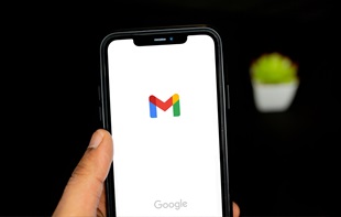
Alright then, what about relatively young companies? Google’s logo redesign a couple of years ago was perhaps one of the most controversial cases. Some even thought the new logo was ‘’infantilised’’, given the nature of typeface. As Google has become a crucial part of our life, it has been quite shocking to see such an abrupt change. But the logic behind the redesign is actually more convincing. Since Google has first become popular, ‘it was generally accessed from a desktop computer’ (via BBC). But the new logo not only allows Google to appear effortless, uncomplex and friendly, but it also lets the brand follow a consistent branding. Today, the company’s challenge is to be easily recognised and understood on a variety of platforms, devices and apps which had not been around when the business was first created. As BBC suggested, Serif typefaces usually fit well with traditional companies of a long history. So Google’s logo redesign is actually a rather sensible move to resemble its playful and contemporary image.
Similarly, other recent tech companies have also refreshed their logos to keep its branding consistent across multiple channels. Airbnb – controversially – decided to completely overhaul its old look on both desktop and mobile interfaces to build a consistent visual image to reflect the brand identity. The new logo symbol (called the Bélo) aimed to convey a universal message of ‘’belong anywhere’’. Therefore It had to be easily recognised globally (via Dezeen). Relatively speaking, it makes sense to create a new logo that anyone from any part of the world can find it simple and familiar. And to replace Roman characters with a symbol can be a sign of creativity and boldness.
So it was unfortunate that when it first came out, people couldn’t help but see other things in the logo.
Uber
While some logo changes received few public attention (like Yahoo), others received much more. Uber was probably not the first one to receive a lot of attention and the avalanche of bitter public opinions at the same time. Just like Airbnb, many found the change early this year rather unfortunate. Whereas the new logo and new site have made it consistently aligned with its business principle, it is far less recognisable. And not to mention that we’re not sure whether it will do a good job at differentiating itself from competitors (as it has been reportedly criticised for resembling with other logos including JP Morgan Chase).
But if we were to make at least something out of this redesign, then it would be their unprecedented ‘customised’ approach to logo design. The new logo presents customised colours and patters to users of different countries.
Yap, users in different countries see a customised version of Uber logo. The company is even planning to roll out city-specific versions of the colours and patterns. But can such customised approach to a logo help the brand easily recognisable or simply make it confusingly inconsistent?
Now, keeping in mind that it is vital to have a logo easily identified and consistent, what’s your take on Instagram’s latest rebranding?
What do you think?
Appnova is a digital agency specializing in web design, UX, e-commerce, branding, digital marketing and social media.
Keep following us on Twitter @appnova and “like” us on Facebook for useful news and tasteful digressions about geeky stuff.


![10 latest trends in digital marketing for beauty brands [Part.2]](/-/media/Appnova/Blog/ScreenShot20151026at1500471940x567/10-latest-trends-in-digital-marketing-for-beauty-brands-Part-2.jpg?mw=310)
![10 latest trends in beauty web design and digital marketing [Part.1]](/-/media/Appnova/BannerImages/18376519151_bbeaa6dafc_b-1/trends-in-beauty-web-design-and-digital-marketing/10-latest-trends-in-beauty-web-design-and-digital-marketing-Part1.jpg?mw=310)


)
)
0.Comments