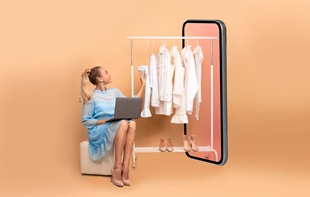
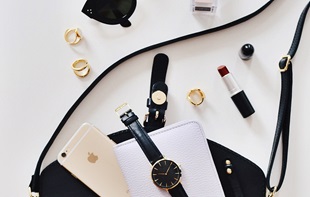
Email marketing strategy: the lessons from fashion eCommerce sites
Email marketing strategy remains vital to eCommerce
It’s been a while since we talked about Asos’ savvy reminder email strategy that keeps customers engaged post-purchase. It has proven that emails are still the most powerful and effective way to lure ‘valuable’ customers back to where they previously abandoned their shopping carts.
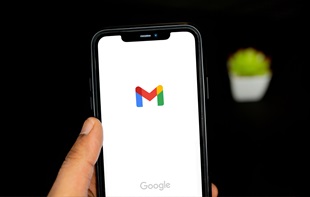
Despite the rise of social media, email marketing is far from dead. Not only is it alive, email remains the top direct marketing channel. Fashion eCommerce newsletters are, hence, vital to keep customers in the loop. So how are brands using this ‘permission-based marketing’ (i.e., customers giving brands the permission to be sold)? That is to say, how are top fashion eCommerce brands taking full advantage of email marketing to reconnect with customers who are expecting to hear from their favourite brands?
Different target audience, different email strategies?
Now that we know email is the most effective tool if used correctly, we’ve carefully observed several fashion eCommerce brands’ newsletters. We looked at various factors including the use of subject lines, content, tone of voice and personalisation, all of which brands utilise to urge the recipient to open emails and reconnect with the brands. Here are the highlights.
Subject lines and content
Uniqlo is an innovative clothing retailer best known for its cutting-edge approach to fashion and design. To name a few, its Heattech collection and modest ‘wear collection’ including a stylish range of hijabs. So has its innovative mind well reflected on its email strategy to keep their audience enticed? My candid opinion is, ‘not bad at all, but they could do much better than this’. Without any intention for nitpicking, their email tends to become a little too ‘technical’ and less emotionally enchanting.
In terms of subject lines, Grana, an online-based fashion startup that also offers premium materials at an affordable price point, knows how to make it punchy, impactful and engaging. Grana was also one of the few bold ones who used user-generated content in their email content, showcasing best dressed customers’ Instagram shots.
Who said that we can’t share customer reviews and testimonials via email? In its email titled as ‘The verdict is in…’, the customer reviews are presented in a crisp and light-hearted way. Among all brands, Grana was the most adept at capturing my attention with such smart subject lines that make me open their email instantly. (Unlike some others who relied too much on words like ‘FREE’ or ‘SALES’!)
Good content equals returning customers?
While Ted Baker’s email subject line didn’t necessarily stand out from the rest, its content was exceptionally rich in beautiful and full-screen images. Yet, emails containing excessive images don’t always turn positive. While Lululemon Athletica’s newsletter is rife with highly relevant stories and motivational messages (linked to video and blog), its emails didn’t always show up nicely on my mobile device. Due to the number of images, it meant more scrolling on the mobile interface.
It seems so easy for brands to falls into the pitfalls of responsive design. While it allows any email design to adapt itself to all device screens, it also generally means more scrolling, making an email twice or even three times longer. To give an example, the below email design from Reiss on a mobile interface appeared way much longer on mobile as every product image (each pair of denim) was taking up almost full screen.
The risk is that when you reach the point where scrolling becomes mundane, then you are more likely to lose the customer’s attention.
When do emails get too much sales-y?
Unlike Lululemon Athletica, Jack Wills’ email strategy primarily focused on pushing its mid-season sales. Three out of four emails I received in a week featured the exact same messages – 60% Off – with slightly different approaches – by price, size and top sales. While massive discounts will help drive customers to the website, four emails with very similar content seemed lacking in creativity and originality.
On the other hand, Urban Outfitters opted for more bold and playful content focused on lifestyle in general. Their emails are not only concerned with driving readers to their eCommerce shop, but also encouraging to check out UO’s Instagram and blog.
Newsletter subscription
Last but definitely not the least, it’s also worth spending some time looking at how different brands design their sign up buttons. Almost all the sample eCommerce sites use a simple and short subscription form, encouraging visitors to take an action.
Lululemon Athletica, for instance, simplified its email signup form to a single field box and also saved much space by reducing its terms and conditions to a popup (see above). In fact, Hobbs’ eCommerce site was the only one that still used a form, which could look slightly more tedious than its competitors’.
UO was one of the few who gave a small ‘thank you for subscribing’ treat.
Final notes
With so much information available now, consumers’ attention spans are much shorter. Keeping that in mind, branded email marketing should be succinct, honest and entertaining. The bottom line is – will the recipient open the email and engage with the content? The subject lines should be short and precise, while the content should be relevant and engaging. Whilst there’s nothing wrong about emails entirely dedicated to promote sales and offers, readers are more likely to hit unsubscribe button if frequently bombarded with such emails. In contrast, brands sending emails with each containing a variety of contents tend to be more successful in reconnecting with customers.
What do you think?
Appnova is a digital agency specializing in web design, UX, e-commerce, branding, digital marketing and social media.
Keep following us on Twitter @appnova and “like” us on Facebook for useful news and tasteful digressions about geeky stuff.


.jpg?mw=310)


![The impact of online reviews on your business [Infographic]](/-/media/The-impact-of-online-reviews-on-your-business.jpg?mw=310)

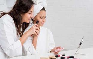
![10 latest trends in digital marketing for beauty brands [Part.2]](/-/media/Appnova/Blog/ScreenShot20151026at1500471940x567/10-latest-trends-in-digital-marketing-for-beauty-brands-Part-2.jpg?mw=310)
![10 latest trends in beauty web design and digital marketing [Part.1]](/-/media/Appnova/BannerImages/18376519151_bbeaa6dafc_b-1/trends-in-beauty-web-design-and-digital-marketing/10-latest-trends-in-beauty-web-design-and-digital-marketing-Part1.jpg?mw=310)


![15 crazy things people search on Google [Infographic]](/-/media/crazy-things-people-search-on-Google.png?mw=310)


![How to LOSE Twitter followers in 15 ways [Infographic]](/-/media/Appnova/Blog/08-internal-768x534.jpg?mw=310)


)
)
0.Comments