Is sticky header good for user navigation?
The importance of navigation cannot be underestimated when it comes to website design. In fact, 94% of customers say a website must be easy to navigate. One of the most critical elements of a website’s navigation is the header.
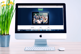
A Sticky header, also called a fixed header, is a smart navigation tool that fixes the menu to the top of the screen as the user scrolls down a page.
Today we see many web designers adopting sticky headers as a way to arrange and structure a website for better user navigation, using not-so-complicated CSS coding.
It goes without saying why some designers prefer this technique. And our intuition tends to agree with this popular web design trend.
Before we jump to the conclusion that it is the best solution for all types of websites, from social media to content-heavy sites, we need to step back and evaluate its pros and cons.
What is a sticky header?
What is sticky navigation? A sticky header, which is also referred to as a fixed header, is a kind of navigation bar or header element that remains visible and fixed in place as the user scrolls down a webpage. This means that as the user scrolls, the header will stay at the top of the screen and remain visible, instead of scrolling off the top of the page as is typical with a standard header.
The purpose of a sticky header is to provide easy access to important information and navigation elements, even as the user moves further down the page. This can be particularly useful for websites with a lot of content or long pages, as it enables the site user to quickly access key information without having to scroll back up to the top of the page.
Pros and cons of sticky headers
So, there was an interesting discussion on an online forum on whether sticky headers improve the user experience or not. And here are the most common arguments for the use of sticky headers:
Pros:
- Time-saving
You have probably experienced this before – scrolling endlessly to go back to the menu bar on the very top after realising that you were browsing the wrong page. With a sticky header, however, users are able to jump to different sections easily, as the menu bar always appears on the screen.
- Good navigation
So, it is the fastest and most useful way to access the right information for the end users. That should make a sticky header good for user navigation. For example, a study showed that they are 22% faster to navigate, and many participants preferred a website with fixed headers without knowing the exact reason. This particularly comes in handy on a mobile interface where text tends to be longer.
- Branding effect
Here’s another minor advantage to add – it also helps you build your brand, as your brand logo/name will always be there on the page next to the header.
Cons:
- Waste of space
But here’s a catch – a sticky header tends to eat up some valuable space as it is fixed permanently on the screen. Imagine you already have a beautiful and functioning website, adding a fixed header may seem excessive. It not only reduces the space for text but also cuts off background imagery.
- Distracting
Also, if implemented badly or incorrectly, it could even disrupt how the page is presented. Sticky navigation ‘does not always render effectively on mobile and tablet devices’. Those who are against sticky headers often argue that users visit the website for content, not navigation. Some users may find it disruptive to the ‘natural flow’ of the web page, while others prefer it for navigation reasons (and this is when user testing comes in useful).
Sticky header vs fixed header
Sticky headers and fixed headers are similar design elements, but there is a subtle difference between the two.
As explained, a sticky CSS header is a type of navigation bar or header element that remains visible and fixed in place as the user scrolls down a webpage. This means that as the user scrolls, the header will stay at the top of the screen and remain visible, instead of scrolling off the top of the page as is typical with a standard header.
A fixed header, on the other hand, is a header that is always visible at the top of the screen, even when the user scrolls. Unlike a sticky header, a fixed header does not move as the user scrolls but remains in a fixed position on the screen.
The key difference between the two is that a sticky header remains visible only when the user scrolls past it, while a fixed header is always visible regardless of where the user is on the page.
In terms of design, sticky headers are often used on websites with long pages or a lot of content, where it's important for users to have quick access to important navigation elements. Fixed headers are often used on websites where the header contains branding or other important information that should be visible at all times.
Both sticky headers and fixed headers can be useful design elements, but the choice between the two depends on the specific needs and goals of the website.
Things to avoid when using sticky headers
While sticky header navigation can be a useful design element, there are a few things that you should avoid when using them:
- Overuse - Don’t use sticky headers on every page of your website. This can make the website look cluttered and can be distracting for users.
- Too much height - Avoid creating sticky headers that take up too much space on the screen. This can reduce the amount of content that is visible and can make the website feel cramped.
- Confusing navigation - Ensure that the navigation links in your sticky header are easy to understand and very clear. Avoid using too many links or using confusing labels that might confuse the user.
- Slow loading - A sticky header that takes too long to load can be frustrating for users. Ensure that the header is optimised for performance and doesn't slow down the website.
- Inconsistent design - Ensure that the design of your sticky header is consistent with the rest of your website. Inconsistent design can make the header look out of place and can be confusing for users.
Sticky header examples
There are a number of websites that use sticky headers. Examples include the following:
Dropbox
The Dropbox website uses a sticky header to provide quick access to the navigation menu, search bar, and user account information.
The header includes a clear and consistent design with bold icons, making it easy for users to navigate and access their files.
The sticky header allows users to access important features, such as file sharing and collaboration, without interrupting their workflow.
Airbnb
The Airbnb website uses a sticky header to provide quick access to the navigation menu, search bar, and user account information.
The header also includes a personalized greeting and prompts users to complete their profile or explore new destinations. This creates a more engaging and personalised experience for users, while also providing easy access to key features of the website.
Canva
The Canva website uses a sticky header to provide quick access to the navigation menu, search bar, and user account information.
The header also includes a variety of helpful links, such as design templates and tutorials, making it easy for users to get started with the design tool.
The sticky header allows users to navigate the website and create their designs without interruption, enhancing the user experience.
The Twitter website uses a sticky header to provide quick access to the navigation menu, search bar, and user account information.
The header also includes real-time notifications and alerts, such as new tweets and direct messages, allowing users to stay connected and engaged with their followers.
The sticky header makes it easy for users to navigate the website and stay up to date with their Twitter activity.
Grammarly
The Grammarly website uses a sticky header to provide quick access to the navigation menu, search bar, and user account information.
The header also includes a progress bar, which shows users how much they have written and provides feedback on their writing quality. This creates a more interactive and helpful experience for users, while also making it easy for them to navigate and use the website's features.
Some recommended solutions
If you are a UX designer, you might have already found that there is no simple yes-no answer to this question. Everything depends on the context. Depending on what kind of website you are designing, you will need to weigh the significance of both pros and cons.
If you are creating an informative, content-heavy web page, then you might find having a fixed header more important than leaving your users feeling lost and stranded. In this scenario, it is more plausible that a user is more likely to land on the wrong page on their first visit.
Also, a sticky header is highly recommended if it is clear what tools are most frequently used by the users. Like Facebook and Twitter, users often update their statuses or read messages while scrolling down to browse other people’s posts.
Otherwise, a sticky header is not always a must-have if your website is primarily aimed at users to interacting with content. Similarly, deciding what a menu bar should contain is just as equally important as deciding whether to include a sticky header at all. A sticky header that merely allows users to jump to completely unrelated pages or sections targeted for distinctive audiences might not be helpful for end users.
But again, we can’t emphasise more on how every website is unique, and therefore need a bespoke navigation solution.
What do you think?
Appnova is a digital agency specialising in web design, UX, eCommerce, branding, digital marketing and social media.
Keep following us on Twitter @appnova and “like” us on Facebook for useful news and tasteful digressions about geeky stuff.
Looking to improve user experience through good navigation design? Get in touch here to tell us about your web project.
This blog post is Last updated on June 23rd, 2023.


![10 latest trends in digital marketing for beauty brands [Part.2]](/-/media/Appnova/Blog/ScreenShot20151026at1500471940x567/10-latest-trends-in-digital-marketing-for-beauty-brands-Part-2.jpg?mw=310)
![10 latest trends in beauty web design and digital marketing [Part.1]](/-/media/Appnova/BannerImages/18376519151_bbeaa6dafc_b-1/trends-in-beauty-web-design-and-digital-marketing/10-latest-trends-in-beauty-web-design-and-digital-marketing-Part1.jpg?mw=310)


)
)
0.Comments