Minimalist Corporate Websites: Why some corporations are missing the point?
Minimalist Corporate Websites: Why some corporations are missing the point?
Not so long ago, I had some good laughs reading BuzzFeed’s post on ‘20 Hilariously Terrible Corporate Websites’. Here is one of my favourite, which looks like a Greek RPG game from the early days. (Apparently it is a corporate website for water treatment service in Greece.)
I don’t want to be mean, but it’s hard to consider it as a professional company when the website looks like a joke.
But what’s the fuss about minimalist web design, anyway? Isn’t the concept overrated by experts?
Yet, most clients seem to love the idea. A minimalist web design doesn’t mean picking a basic colour pallet for background and cutting content into 2 pages. Neither is it a website that came straight out of wireframe. Otherwise every website would end up looking alike.
Removing the unnecessary is just as important as adding things (see thematosoup).
So what are the benefits of a minimalist website for your business?
- Minimise confusion – because a website with too many CTAs is just distracting.
- Quality content – a minimalist web design should ‘enlighten’ viewers.
- SEO-optimised – because Google’s algorithm doesn’t like ‘low-value’, ‘low-loading’ and ‘ad-packed’ websites.
- Eye-candy for everybody!
But we can’t pick on startups hilariously bad websites given their limited resources.
But what about big ones?
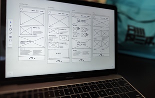
Bam! A website that freshly came out of the wireframe. This one looks more like a minimum web design, rather than a minimalist web design.
Surely Warren Buffet’s website (yes, the company belongs to him) doesn’t need to be pretty and shiny to be ranked high on search engines. But what a disappointment from a guy whose net worth is $65.9 billion (The Forbes).
- UPS (UK)
While its competitor, FedEx (UK) seems to be one step ahead in this game, UPS’s website is not even responsive yet.
Yes, the globally renowned university has a bizarre website.
Obviously they have a different standard of visual arts. I understand it is a very subjective matter. But what about UX and UI? To say the least, they are hurting my eyes.
Also, are those someone’s toes?
Another world’s famous university and its technology company with an unattractive, outdated website. It is hard to believe that they are selling ‘innovative’ solutions to technology transfer.
- Levitt Bernstein
We think websites are the vital asset of architecture firms where they can showcase their creative masterpieces. But an outdated UX design is an antonym of innovation and modern design.
Many companies and organisations tend to underestimate the role of websites as a powerful marketing tool. They also overlook the potential damage a badly-designed website will likely to cause to their company brands.
A heavily cluttered digital interface should be the least thing companies want to offer to your clients.
What do you think?
Appnova is a digital agency specializing in web design, UX, e-commerce, branding, digital marketing and social media.
Keep following us on Twitter @appnova and “like” us on Facebook for useful news and tasteful digressions about geeky stuff.


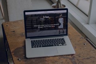


![10 latest trends in digital marketing for beauty brands [Part.2]](/-/media/Appnova/Blog/ScreenShot20151026at1500471940x567/10-latest-trends-in-digital-marketing-for-beauty-brands-Part-2.jpg?mw=310)
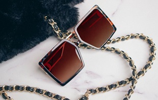
![10 latest trends in beauty web design and digital marketing [Part.1]](/-/media/Appnova/BannerImages/18376519151_bbeaa6dafc_b-1/trends-in-beauty-web-design-and-digital-marketing/10-latest-trends-in-beauty-web-design-and-digital-marketing-Part1.jpg?mw=310)


)
)
0.Comments