What Marketers Should Know About Facebook Rebranding
When it comes to rebranding, it’s important to get it right. You are essentially changing the business image and the face of your company that your user’s associate with you. Businesses need to rebrand eventually, whether they create a new name, logo or changing the design; it is a good way to reestablish yourself from your competitors in the market.
Earlier this month, Facebook announced its decision to rebrand as FACEBOOK for its products and services, differentiating the company from their Facebook app. With the spotlight on the company for more negative publicity, the time for rebranding the company couldn’t have come sooner.
There are many different reasons businesses make the decision to rebrand, from growth or a new audience, or changing in reaction to an event or acquisition. Whilst Facebook has received bad press, let’s take a look at the reason they decided to make the change.
Why Has Facebook Rebranded?
Facebook started out as a single app, but years later they offer a whole host of products. Whilst these technologies have been run by Facebook for several years, many users are still unaware of the connection to the company. Did you know only 29% of Americans knew that WhatsApp and Instagram were owned by Facebook? The company felt they should be clearer about the products and services that they own and offer to their users, having previously adding a company endorsement, and now a new logo.
Although the original Facebook logo is widely associated with the app, there needed to be a clear differentiation between the social site and the company. Accusations about Facebook hiding how powerful it is have now been extinguished through its rebranding, making it absolutely clear what they own on each of their apps. It has allowed them to create an umbrella over their products to unite them under one brand and one community.
What Can We Expect?
The new branding will be active on marketing material, their new website and their main services, including:
- Facebook app
- Messenger
- Workplace
- Portal
- Oculus
- Calibra
As mentioned before, when someone hears “Facebook” they associate it with the app. Facebook notes in their blog post about designing the new company brand that they found this a “unique design challenge”. The wordmark they created is all-caps, keeping the name, but standing out from the app logo. Although it is a simple and clear design, they paid attention to the smaller details like open letter forms, softened corners and diagonals.
Whilst Facebook’s new logo design is really generic, they have however decided to create a brand that responds to its environment. The logo takes on the colouration of their individual brands, sealing the bond between the company and their products.
Facebook’s new branding isn’t the only thing they’ve changed, what’s up with the new Facebook app logo? The social media app’s new design is now the “f” inside a circle, and in a recent update the logo got upgraded to a brighter shade of blue.
Along with Facebook’s rebranding, there comes the task for users who feature the brand for broadcasting purposes and websites. Although multiple updates will be needed for different platforms, it will bring the benefit of creating a consistent look that users will be familiar with. Facebook’s website also provides guidelines to help users present their work on the Facebook app and other products in the best way.
Why Do Big Brands Go For Rebranding?
If a brand is big and widely recognised, often they will rebrand themselves to regenerate, just like shedding an old skin to show off a brand new look. If done right, a new identity ignites existing customer attention and attracts new consumers and investors. Let’s examine a few brands who took the leap and rebranded.
Reebok
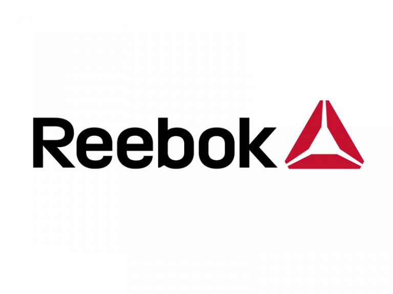
Image Source: Reebok.com
The global sports brand rebranded itself back in 2014, under a new logo and ethos for the company. To compete with other sports brands and its own parent company, Adidas, they made huge changes by appealing to a broader market by focussing on fitness. They have created a community, getting current and being authentic to their market.
Reebok decided to create a new logo to mark the shift in direction with the company. The previous ‘vectorial’ logo has replaced by the Reebok Delta, a symbol they say is a “symbol of change – an invitation to take part, and to unlock your true potential. It’s not a logo, it’s a symbol…a way of life.”
Volkswagon
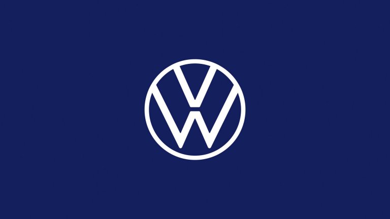
Image Source: Volkswagen-newsroom.com
One of the biggest automotive companies in the world, Volkswagon rebranded this year with a clearer and simple logo. Taking away the old 3D logo affect, they have opted for a sleek, modern 2-dimensional design that works across many digital platforms. To reach a wider audience, they decided to aim towards the individual and sell to a user’s specific needs.
The new design is simple and focused, suitable for crossing many digital platforms and flexible to be altered to any colour for different functions, even on the cars themselves. The rebrand goes beyond the logo redesign as Volkswagon move towards a future of new products, design and neutral emission balance.
John Lewis & Waitrose
This is a classic example of a brand merger or acquisition, as they often initiate rebranding. Once separate companies, John Lewis and Waitrose have stepped away from their generic company name as their logo, and rebranded themselves as ‘John Lewis & Partners’ and ‘Waitrose & Partners’ to reposition themselves as employee – owned businesses. Having their employee’s as co-owners who hold stocks and shares in the companies is a big selling point when hiring.
Through rebranding, the shared design unites the companies and brings clarity for their customers. The logotype is inspired by a pattern created for John Lewis in the 1960s, using a similar proportional relationship and a confident typography together. The new branding is flexible to intergrate with a variety of product imagery and film, optimising it for many platforms and making it a more versatile brand.
Next Steps
Are you thinking about rebranding? If so, take a look at this ultimate guide to successfully rebranding:
- Always start with research – look at current customer and community needs and opinions, your current brand assets, products and services
- Understand your mission and values – Facebook did this effectively by creating a logo with design behaviours of clarity, empathy and creating space to express their ideals and connect their products to their brand.
- Streamline your identity – what are you giving your users, and what makes you stand out from your competitors?
- Communicate effectively – invite your users to witness your journey of rebranding to ensure they are aware of any changes.
- Create effective campaigns both internally and externally to communicate change and entice new customers. Why not have a launch event and spread the word personally?


Subscribe To Us
Contributors
Categories

0.Comments