7 Principles of Timeless Brand Design Every Business Should Know
Why do some names like Chanel, Apple, and Coca-Cola stay instantly recognisable generation after generation, while others slip out of view? It’s not simply heritage or budget. It often comes down to the strength of their design choices and how well those choices hold up through cultural shifts and changing tastes.
Timeless brand design is all about creating an identity that keeps its relevance, clarity, and emotional pull over long periods of time. It avoids looking dated. It stays meaningful even as styles evolve. Most importantly, it gives people something consistent to recognise and connect with.
With trends appearing and disappearing so quickly, businesses need visual foundations that can outlive those trend cycles. Strong design becomes a stabilising force. It adds credibility, builds trust, and helps a brand grow without losing its character.
If you want to understand what actually creates that sense of longevity, there are seven timeless brand design principles that shape an identity built to last.
What Is Timeless Brand Design?
When people describe a brand as “timeless,” they usually mean the design still works years down the line. It stays relevant, it’s instantly recognisable, and it keeps the same emotional pull it had when it first launched. Some identities just don’t age in the way others do, and that’s what sets them apart.
A few qualities tend to show up in brands that manage this:
- Simplicity – A clear, unfussy design usually lasts longer because there’s nothing distracting or overly decorative to date it.
- Consistency – When the look stays steady across different places, it sticks in people’s minds far more easily.
- Authenticity – Designs that come from the brand’s actual values feel more genuine than something created around a short-lived trend.
- Adaptability – Even the most established brands tweak things now and then. The ones that last tend to make small, thoughtful updates rather than dramatic reinventions.
You can see this approach in the way some well-known brands have handled their logos. Nike has kept the same core shape for decades, adjusting a few little details instead of rebuilding it. BMW has done something similar. Hermes too. The design evolves just enough to stay current, but never so much that people no longer recognise it.
7 Principles of Timeless Brand Design
Before getting into the individual brand design principles, it’s worth pausing for a moment and thinking about why certain brands manage to stay visually strong for such a long time. Most of them aren’t chasing whatever style is popular that month. Instead, they rely on design decisions that are steady and intentional. Over time, those decisions become the backbone of the brand.
You might recognise this feeling when you look at a brand that hasn’t changed much, yet still feels completely at home in the present day. That’s usually the result of a small set of principles working quietly in the background, keeping the identity grounded while the world around it moves on.
So, with that in mind, let’s take a look at how to design a timeless brand…
Principle 1: Simplicity is Power

Image Credit: PEXELS
Simplicity sounds easy, but in branding, it’s often the hardest thing to get right. When you’re building an identity, there’s a temptation to add more: more shapes, more ideas, more “just in case” details. The problem is that every extra element competes for attention. Before you know it, the design loses the clear message it’s meant to send.
A simple identity does the opposite. It gets to the point quickly. People recognise it faster, and they remember it for longer because there isn’t much for the brain to untangle. There’s some interesting psychology behind this. Our brains prefer processing clean, recognisable forms. They take less effort to store and recall, which is why minimal logos stick so well.
You can see this in a few famous examples. Apple uses a single, crisp shape. Tiffany relies on a distinctive colour rather than an overly complex mark. The Louis Vuitton monogram has remained strong because the pattern is structured, repeatable, and not overloaded with decoration. It’s not that these brands are “simple” for the sake of it. The simplicity gives their identities room to breathe and evolve without ever losing recognition.
If you’re working on your own brand, one useful approach is to look at each part of the design and ask yourself whether it earns its place. Does it move the idea forward, or is it just there because it felt wrong to remove it? Most strong, long-lasting identities are surprisingly lean once you break them down.
Here’s a thought that often helps during the design process:
Clarity
Hold onto the elements that communicate the core idea, and don’t be afraid to remove anything that adds noise.
Simplicity isn’t about making the design dull or empty. It’s about giving the important parts enough space to do their job properly. When that happens, the brand usually ends up with an identity that feels confident, calm, and strong enough to last for years.
Principle 2: Consistency Builds Recognition

Image Credit: PEXELS
Consistency does something that many brands underestimate. It teaches people what your brand looks and feels like. When the visual parts all line up, the whole identity becomes easier to trust because nothing feels out of place. You’re giving people a steady experience every time they come across you, and that steady feeling is what builds recognition.
Think about the components that shape a brand day to day. It isn’t only the logo. It’s everything around it:
- Fonts – The type styles you return to again and again.
- Colours – The shades that people start to associate with your name.
- Tone of voice – The way you write or speak, which often says as much as the visuals.
- Imagery style – The mood and character of your photos or graphics.
When these pieces look like they belong together, the brand develops a kind of rhythm. People start to recognise it even when the logo isn’t in view.
A good example of this is Chanel. The brand’s commitment to its black and white aesthetic has been incredibly steady. You’ll see the same refined look across packaging, campaigns, and even store layouts. That level of consistency means someone can spot something from the brand almost instantly, without needing to check twice.
If you’re building your own identity, it helps to put some structure around your choices. Not strict rules, but a clear reference you can return to as the brand grows:
Alignment
Gather your visual decisions in one place so everything you create stays connected, no matter the platform.
When the brand speaks with one clear visual voice, it becomes far easier for people to recognise you and even anticipate what your brand stands for.
Principle 3: Authenticity Creates Emotional Connection
Authenticity isn’t about sounding inspiring or trying to look “real.” It’s simply about being aligned. When a brand’s design matches what it actually believes in, people feel that. It comes across in a quieter, more natural way, and that’s usually what creates a genuine emotional response.
You’ve probably noticed this yourself. Some brands just feel honest. Nothing about the design seems exaggerated or put on. The visuals, the tone, the little details… they all come from the same mindset. That’s the heart of authenticity.
So how do you get there? A few things help:
- Values – Let what the brand stands for influence the design choices.
- Culture – Show the personality behind the brand instead of trying to smooth everything out.
- Visual behaviour – The colours, the photography, the overall mood should reflect who the brand is at its core.
A well-known example is Patagonia. The brand talks a lot about environmental responsibility, and the design follows that same direction. The imagery feels grounded, the tone is straightforward, and the whole identity has a kind of honesty to it. Nothing looks overly polished or glossy, and that’s exactly why people trust it.
If you’re shaping your own brand, it’s useful to check whether the design represents the real character of the business. Not a trend, not whatever is popular right now, but the actual personality and purpose behind it. When the visuals reflect that truth, the connection with people becomes much stronger.
Principle 4: Adaptability Ensures Longevity
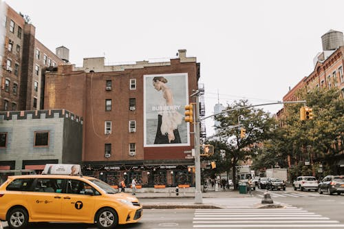
Image Credit: PEXELS
A brand can stay recognisable and still change. The two things aren’t opposites. Most long-standing brands adjust their look over time, just not in a way that breaks what people already know.
Take Google as an example. The logo has been updated several times, but only in small steps. Cleaner lines. Better readability on screens. Same overall idea. Burberry took a similar route with its refresh. The look shifted, but the heritage wasn’t pushed aside.
If you’re thinking about your own identity, it helps to look at the design in layers. Some parts are your foundation. Others are style choices that can move with the times.
A simple way to frame it:
Keep the essential parts
Let the rest evolve when it makes sense.
That balance is what keeps a brand steady while still allowing it to grow.
Principle 5: Emotion-Driven Storytelling
Design isn’t only about how something looks. It’s also about how it makes people feel. A brand that taps into emotion usually stays in people’s minds for much longer. It might spark a sense of nostalgia, create a feeling of trust, or give people something aspirational to connect with. Those reactions are what turn a visual identity into something meaningful.
Most of us can think of brands that do this well. Coca-Cola is an obvious one. For years, the brand has tied its visuals and messaging to moments of happiness and togetherness. The colours, the imagery, even the typography all lean into that upbeat feeling. It’s consistent, and that consistency is why the emotional link lasts.
If you’re shaping your own brand, it helps to decide what you want people to feel before you think about the visuals. That makes it easier to choose elements that support the emotion you’re aiming for, such as:
- Colour cues – Shades that reinforce the tone you want to set.
- Imagery – Scenes or styles that carry the right mood.
- Typography – Letterforms that match the personality of the message.
When all of these elements work together, the emotion becomes clearer, and the brand feels more unified. That emotional layer often makes the biggest difference in how long the design stays relevant.
Principle 6: Cultural Relevance and Universality
Image Credit: PEXELS
A brand doesn’t need a different identity for every country, but it does need some awareness of how people interpret things. You can keep the main look the same and still adjust the details so they feel right in different places. That balance is what helps a brand stay global without feeling out of touch.
Different cultures pick up on different cues. Colours mean different things. Certain photos feel natural in one place and completely off in another. When a brand pays attention to that, the design lands better.
Look at how Gucci handles this. The core identity is unchanged, but you’ll see campaigns shift slightly depending on the region. The tone or the visuals might be tweaked, but the brand is still instantly recognisable.
If you’re working on your own brand, it doesn’t need to be complicated. Just test your visuals with a range of people and see how they respond. A simple check can save a lot of awkward misunderstandings.
Something to keep in mind:
Different eyes
Make sure your design feels comfortable and respectful to the audiences you’re speaking to.
That mix of a clear identity and cultural awareness is usually what helps a brand stay relevant everywhere, not just in one place.
Principle 7: Strategic Use of Typography and Colour
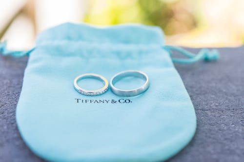
Image Credit: PEXELS
Typography and colour do a lot of the heavy lifting in brand design. They quietly shape how people judge a brand long before they look at the details. Most of us react to these things without even thinking about it, which is why the choices need to feel intentional and aligned with the brand’s personality.
Some brands show how powerful this can be. Tiffany’s blue is so distinctive that you could remove the logo and people would still recognise it. Vogue’s serif lettering works the same way: it has a kind of timeless confidence that fits the brand perfectly. Those decisions didn’t happen by accident. They stuck because they reflected the character of the brand.
When you’re working on your own identity, it helps to look at what you want people to pick up on immediately. A few areas to think about:
- Tone – The overall feeling you want to give off, whether calm, bold, classic or modern.
- Readability – Fonts need to look good and work well across different sizes.
- Colour meaning – Different shades can carry associations you’ll want to be aware of.
- Contrast – Strong combinations help the design feel confident and easy to scan.
- Personality – The mix of type and colour should match how the brand behaves.
Once you’ve made these choices, try to keep them consistent. Over time, the colours and typography start to become their own recognisable signals, which is one of the reasons strong brands feel so steady.
How to Apply These Principles to Your Brand
Knowing the principles is one thing. Putting them into practice is where the real work begins. It doesn’t have to be overwhelming, though. If you break it down into a few clear steps, you’ll start to see where your brand is strong and where it might need a bit more attention.
Here’s a simple way to approach it:
Brand audit
Take an honest look at what you already have. Are the visuals consistent? Do they still represent what the brand stands for? This step usually reveals gaps you didn’t realise were there.
Refine your visual identity
Once you know what needs attention, start shaping the visuals so they line up with your values and your long-term direction. This might mean adjusting colours, typography, or simplifying certain elements.
Create a brand book
Pull everything together in one place. Not a huge document, just a clear guide that shows how your visuals, tone and layout should behave. It makes it much easier to keep things consistent as the brand grows.
Allow subtle evolution
Avoid the temptation to reinvent everything when styles shift. Most strong brands move in small steps. Keep the core familiar, and adjust the parts that no longer feel right.
These steps help you build an identity and branding strategy that feels steady, recognisable, and capable of lasting for years, not just until the next trend rolls in.
Common Mistakes to Avoid
Here are a few slip-ups that come up all the time, and they’re surprisingly easy to fall into:
- Trying to squeeze in every idea – When you’re excited about the brand, it’s tempting to add everything. The problem is that the message gets lost.
- Redesigning too often – A refresh now and then is fine, but if the look keeps changing, people never get a chance to recognise you.
- Forgetting how colours are read – Some colours carry strong associations. If you ignore that, the design can send the wrong message without you realising.
- Using fonts that don’t match your personality – Typefaces have moods. Pick the wrong one and the whole thing feels off.
- Overthinking the logo – People remember simple shapes. Adding lots of detail usually makes it harder, not better.
- No clear guidelines to follow – Without a basic set of rules, every piece of design ends up looking like it came from a different team.
- Chasing whatever’s trending – Trends move fast. If you rely on them too much, the brand ages quicker than you’d like.
Think of these as little checkpoints. If you keep an eye on them, it gets a lot easier to build a brand that actually lasts.
Building a Brand That Lasts
Timeless design isn’t really about chasing a modern look. It’s about choosing visuals and ideas that stay meaningful as everything else changes. When a brand has that kind of foundation, it feels steady, familiar, and confident – the sort of presence people come back to without thinking twice.
The brands that manage this don’t spend their time trying to keep up with trends. They understand what they stand for, and they make design choices that support that direction. Over time, they become the ones setting the pace.
If you’re looking at your own brand and thinking it might be time for a refresh, or even a full rethink, these principles are a great place to start. And if you’d like a hand shaping a visual identity that can actually last, you can find out more about our visual identity design service. Please don’t hesitate to get in touch with our team if you have any questions. We’d love to hear from you!
Frequently Asked Questions
What makes a brand design “timeless”?
A timeless design stays relevant even as styles shift. It’s usually simple, consistent, true to the brand’s values, and able to evolve without losing its core identity.
How often should a brand update its visual identity?
Most brands benefit from small updates every few years. These tweaks keep things current without disrupting recognition. Big overhauls are only needed when the brand has changed direction.
Can a small business create a timeless brand design on a budget?
Yes. Clear thinking matters more than a huge budget. Strong choices around colour, typography, and layout can go a long way, especially when they’re used consistently.
What role does typography play in timeless branding?
Typography sets the tone before anyone reads the message. The style of the letters — refined, bold, playful or modern — shapes how the brand feels and becomes a recognisable part of its identity.
Why do luxury brands tend to have timeless designs?
Many luxury brands focus on clarity, heritage and restraint rather than trends. They build identities around long-standing values, which naturally leads to a design style that holds up over time.


Subscribe To Us
Contributors
Categories

0.Comments