Designing the best communication tool
Since we work with a ton of information and ideas, sometimes things can get a bit complex. Surely a simple note or Excel sheet can help us organize data. But are they the most effective way to communicate ideas and data within a team? Unfortunately, not always.
So, as a multidisciplinary team, we think that data visualisation is the best way to communicate complex information.
Why do we need it?
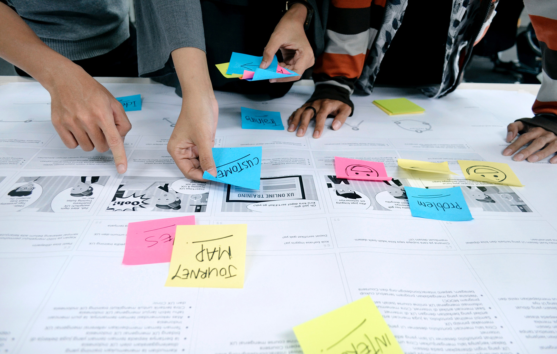
By definition, an information radiator is a shared visual board used to communicate project information within an Agile development, which looks something like this:
It’s simple – we use this method so that communication becomes more efficient.
An information radiator encourages interaction in a cross-functional team and transparency within the company. It is also a great way to show your work progress to your team members as well as stakeholders at a glance.
You know the feeling that you can’t even remember your New Year’s resolution at the end of the year? A person can’t absorb every fact or information she or he encounters every single day. That’s why heavy documentation can be ineffective and confusing. With information radiators, however, such risk is minimal.
Also that’s why building information radiators play a crucial role in connecting the ‘dots’ that are constantly moving and changing their shapes (surprise, surprise). So when heard about this BA/UX meet-up on information radiators , we got really excited about exploring this field further.
Lessons from the workshop
So what’s the best way of building information radiators? Let’s explore it together based on a specific case study.
Case study: Know Your Customers
Key questions:
- How to show customer understanding changing with research?
- What needs are validated?
- What remain to be challenged?
Imagine a scenario where a trendy fashion and lifestyle retail like Muji approaches your company with an idea to expand their business.
Step 1. What are their objectives?
Let’s assume that their goal is to increase in-store sales by installing self-checkout machines (for the sake of simplicity).
Now, write down every potential feature they want to incorporate into their stores, as specifically as possible on a sticky note. Examples include multi-language self-checkout and payment using Bitcoins or PayPal.
Step 2: Creating a persona
At this point, we presumed our target customers were mothers, young professionals and students. However it is also useful to keep in mind that a persona is often subject to changes as a result of real user testing.
Step 3: Place your ‘features’ stickies in a quadrant
Alright, this is the fun part – we get to stick our notes on a board! As we found out the client’s needs, we deployed them in a quadrant showing the scope of time/cost in x-axis and value in y-axis.
So the right bottom of Quadrant (i.e., Quadrant IV) is the LEAST ideal place, costing the client time and money while creating minimum values. For example you could assume that PayPal payment is actually not as commonly used, and therefore creates less value as anticipated.
Step 4: Reflecting the real user testing results
Following a series of real user research, it’s time to rearrange the stickies to reflect the changes. However, to show the work progress (either to the team or to client), we replicated the exactly same board and adjusted the stickies according to our findings.
As the research findings suggested that the majority of users are either busy mothers or time-oppressed female professionals between 25 to 40 years old, we moved some features such as multi-language and Bitcoin payment down to the least priority. On the other hand, we shifted other features that would presumably facilitate the checkout process.
Step 5: Categorising
Categorise each functionality into ‘’Approved’’ or ‘’Challenging’’. Et voila! The board visually allows you to grasp the gist of changes at a glance, while encompassing detailed information of progress at the same time.
Key takeaways
So what are the key lessons from this information radiators workshop?
Building an information radiator can be done in a variety of ways. The one we used is only one of techniques that can be employed. Looking back, there are many things that we could have improved such as colour coding. But, since information radiators are not static, they always allow such tweaks and adjustments quickly and effectively.
That’s pretty much why we fell in love with them.
What do you think?
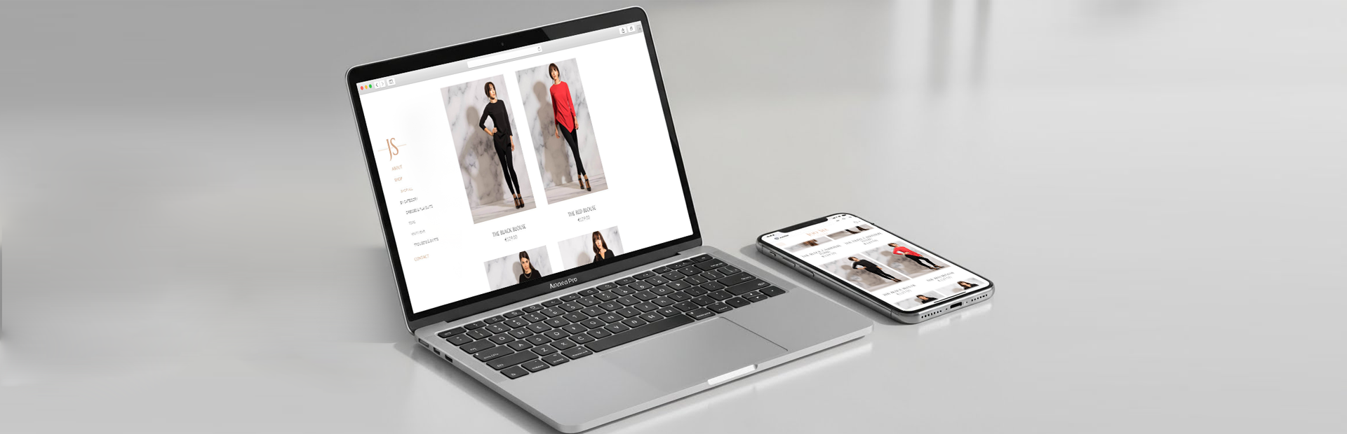
Appnova is a digital agency specialising in web design, UX, eCommerce, branding, digital marketing and social media.
Keep following us on Twitter @appnova and “like” us on Facebook for useful news and tasteful digressions about geeky stuff.


0.Comments