Stunning 20 Web Design Trends to Watch in 2025
Here’s the truth: most websites don’t get remembered. You click, skim, maybe find what you need, and move on. A week later, you couldn’t describe what it looked like if you tried.
But every so often, you land on one that feels different. It feels like it actually gets what you’re there for. Perhaps it looks incredible, or it works so seamlessly that you don’t even notice the design; you simply enjoy using it. Those are the sites people come back to.
In 2025, those are the sites your business needs to compete with. The days of “good enough” are gone. Visitors expect something sharper, smoother, and far more personal than they did even a couple of years ago.
So what actually makes a website feel like it belongs in 2025? We’ve pulled together 20 of the latest website design trends that are worth paying attention to!
Modern Web Design Trends for 2025
Web design today feels very different. The tools are more intelligent, the visuals are bolder, and the focus is shifting towards experiences that feel personal rather than generic.
If your site feels stuck in 2023, it will show. So, let’s take a look at some of the top web design trends for 2025 in more detail.
1. Hyper-Personalised User Experiences
What is it?
Most sites still look exactly the same, no matter who’s visiting. Hyper-personalisation changes that. It’s when a site adapts to the person using it, showing different content, layouts, or suggestions based on things like where they are, what they’ve done on the site before, or even the time of day.
Done well, it makes browsing faster and feels less like digging through pages to find what you need.
Why it’s trending in 2025
People are used to personalised experiences from big platforms, so when a site feels generic, it stands out for the wrong reasons.
AI has also made this level of personalisation accessible to more businesses, not just global brands.
Users expect a site to feel like it understands them, at least a little, without asking them to do the work.
Real-world example
Travel site Secret Escapes adapts its homepage and landing page content dynamically based on the search terms or ad clicks. For instance, if a visitor searches for “city breaks” and clicks through via a relevant ad, they see tailored imagery, messaging, and offers geared specifically toward short city trips, not generic travel promotions.
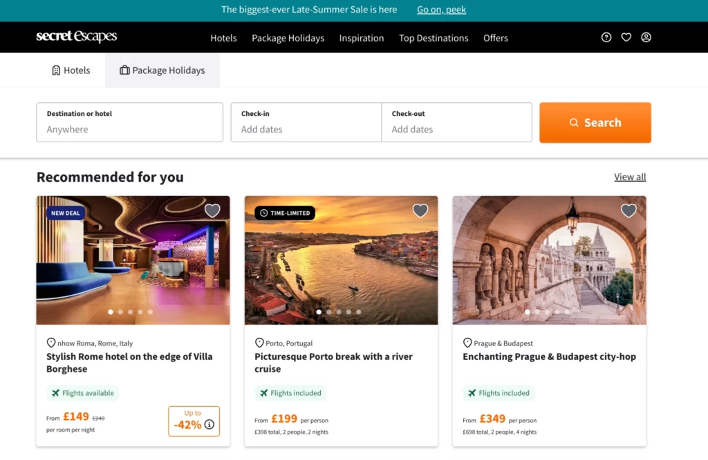
Image credit: Secret Escapes
How to use it
Personalisation doesn’t have to be complex, and you don’t need AI running every corner of your site. A few smart, intentional changes can make your site feel much more relevant to each visitor:
- Show returning visitors something new – Skip the generic hero banner and highlight content or products they haven’t seen yet.
- Use location sensibly – Offer region-specific services or pricing that feels useful, not creepy.
- Let behaviour guide content – If someone reads three blog posts in one category, suggest more from that area next time.
- Remember where they left off – Show recently viewed products or re-surface abandoned cart items without overdoing it.
- Avoid going too far – If it starts to feel like surveillance, people will back off. Keep personalisation helpful, not invasive.
2. AI-Generated Visuals and Layouts
What is it?
AI isn’t just a behind-the-scenes tool anymore. This year, more websites are letting AI create on-brand graphics, update page layouts, and even build alternative versions of pages automatically.
Instead of designers manually crafting every banner or testing every small change, AI can handle the repetitive work, allowing teams to focus on larger creative decisions.
Why it’s trending in 2025
Websites have to move fast. New campaigns, product launches, and seasonal changes can’t take weeks to design and publish anymore. AI speeds up that process by producing visuals and layout tweaks in a fraction of the time. It’s not about replacing people. It’s about keeping sites fresh without the usual delays.
How to use it
If you want to bring AI into your site design without handing over full control, start with one task that usually slows you down. That could be:
- Create quick campaign graphics – Save time by generating social banners or homepage visuals without needing a full design cycle.
- Test layout variations – Use AI tools to shuffle headlines, images, or buttons and see what performs better.
- Tweak pages based on behaviour – Let AI spot where users drop off and adjust content flow to keep them engaged.
- Auto-refresh visuals – Set up rules so seasonal or time-sensitive graphics update without manual changes.
- Speed up A/B testing – Generate and test multiple design versions quickly without needing full team input each time.
- Keep control over brand consistency – Use AI to assist, but not override, your brand style and tone.
These changes help your site feel more dynamic without needing a full redesign every time something new happens.
3. Immersive 3D Elements
What is it?
Flat, static websites are starting to look dated. More businesses are adding interactive 3D touches that make a site feel alive.
It’s not about turning your homepage into a video game. It’s about using depth and interaction where it actually improves the experience, like letting people rotate a product to see every angle, or adding subtle layers that make a landing page feel more dynamic as you scroll.
Why it’s trending in 2025
People expect more from a website than they used to. They’re already used to interactive visuals from social media filters, AR shopping tools, and even the apps they use every day. On top of that, faster browsers and lighter code mean 3D doesn’t have to wreck your load times anymore, even on mobile.
That shift has opened the door for brands to make their sites feel more modern without punishing performance.
Real-world example
IKEA does this well. Their online catalogue lets you rotate and zoom in on furniture to get a real feel for scale and texture. It bridges the gap between in-store browsing and online shopping, making it easier for customers to feel confident about what they’re buying. You can even look at interior design photos from social media, where you can easily add the items in the image to your shopping basket.
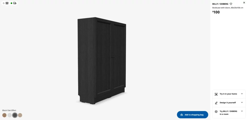
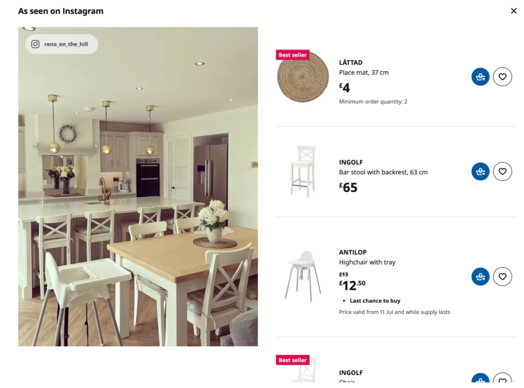
Image credit: IKEA
How to use it
3D can make your site feel more premium, but it only works if it serves a purpose. If you’re thinking about using it, start with ideas that actually help your visitors:
- Let people explore products properly – Rotating views or zoomable details give shoppers confidence to buy.
- Add layered scrolling effects – A bit of depth as someone moves down a page can make the experience feel smoother.
- Use small, interactive details – Buttons, icons, or hover effects with light 3D touches can make a site feel polished without going over the top.
- Give shoppers an AR option – For retailers, letting people see how an item looks in their space can close the gap between browsing and buying.
- Keep it fast – Use lightweight assets and test everything on mobile so the experience stays smooth.
- Don’t overload the page – Two or three 3D touches can make a site feel sharp. Ten of them will just slow things down and annoy visitors.
Used sparingly, 3D can make a site feel modern and interactive. Used as decoration, it becomes the thing people blame when the page takes too long to load.
4. Voice-Optimised Interfaces
What is it?
More people are searching, shopping, and finding information without typing a single word.
Voice-optimised sites are designed to work with that behaviour. They make it possible for someone to search or navigate just by speaking, which is becoming common as voice tech moves beyond smart speakers and into phones, browsers, and apps.
Why it’s trending in 2025
Using voice is simply faster, especially on mobile. People are used to asking their Alexa to add milk to the shopping list or checking the weather hands-free. Now they expect the same ease when browsing or buying online.
Sites that aren’t built for this can feel frustrating, forcing users to tap through menus or type long search terms when they’d rather just ask for what they need. This is why it makes sense to enquire about voice when making the most of web development services.
Real-world example
Tesco has leaned into voice ordering through smart home devices, letting shoppers add items to their basket or reorder basics by speaking. A lot of other online supermarkets and retailers are now doing the same. If someone is used to saying “add coffee to my basket” at home, your site will feel clunky if it can’t offer a simple way to achieve the same outcome.
How to use it
You don’t need to build a complex assistant to get the benefits. Start with one or two improvements that make your site easier for voice users:
- Add a voice search feature – Especially on mobile, it removes friction and speeds things up for users.
- Structure content for natural language – Write how people speak, so voice tools can understand and deliver answers more easily.
- Simplify menus and structure – Voice tools struggle with complex site hierarchies. Keep paths short and clear.
- Use descriptive page titles and headings – This helps voice assistants read your content properly.
- Test with actual voice tools – Don’t guess. Use Siri, Google Assistant, or Alexa to see what they can and can’t interpret on your site.
- Prioritise FAQ-style content – People ask questions out loud. Build content that answers them directly.
These updates not only make your site more accessible, but they also prepare it for the way browsing habits are continuing to shift this year.
5. Kinetic Typography
What is it?
You’ve probably seen it this year: text that feels alive. Headlines that gently slide in as you scroll. Words that stretch or shift to draw your eye to a key point. Calls-to-action that pulse ever so slightly to get your attention without shouting. That’s kinetic typography.
It’s animated text used to add energy and flow to a page, without drowning it in heavy visuals or videos.
Why it’s trending in 2025
Keeping someone’s attention online is getting harder. Most visitors skim. Static text often blends into the page, but a touch of movement can stop them for just long enough to make a point.
It’s also lighter than full-motion graphics, so sites stay fast on mobile, which is where most traffic now comes from.
Designers are leaning on it because it’s one of the few ways to make a page feel dynamic without big performance trade-offs.
How to use it
If you want to bring kinetic typography into your site without making it look chaotic, focus on these:
- Guide attention, not distract – Use animation to lead the eye to a headline or call-to-action, not to decorate every corner.
- Keep the motion smooth – Slow fades, glides, and scaling effects look professional. Fast, jerky text feels cheap.
- Test on mobile devices – An animation that looks great on a large screen can feel awkward on a smaller one.
- Optimise for speed – Lightweight animations load faster, keeping your site smooth for all users.
- Offer a reduce-motion option – Some visitors prefer a static experience for accessibility or preference.
- Use it sparingly – One or two animated elements per page can enhance a design. Covering every section in motion usually does the opposite.
6. Accessibility-First Design
What is it?
Websites built in 2025 are being built so everyone can actually use them. Accessibility-first design means making sure that people with visual, hearing, motor, or cognitive impairments can navigate your site without frustration. It’s being baked into design from the very beginning.
Why it’s trending in 2025
Regulations are tightening, but it’s more than just legal pressure. People expect websites to be usable by everyone, and businesses can’t afford to shut out potential customers because of poor design choices.
Voice tools, screen readers, and keyboard navigation have become standard for many users; sites that ignore these needs risk losing traffic quickly.
Real-world example
Government websites in the UK have led the way on accessibility by law, but many large retailers have followed suit. Sites like John Lewis have put heavy focus on screen reader compatibility, high-contrast modes, and simplified navigation, making their online stores easier for all shoppers to use.
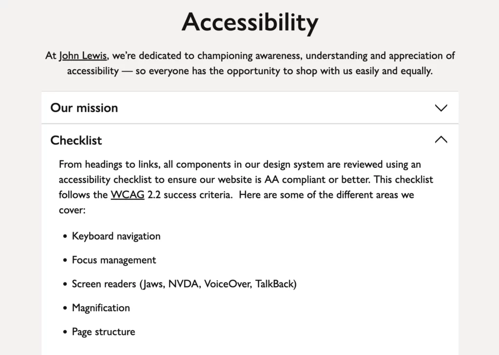
Image credit: John Lewis
How to use it
If your site hasn’t been updated with accessibility in mind, there are a few changes that can make a big difference straight away:
- Readable text – Avoid tiny fonts and low-contrast colours that strain the eyes.
- Alt text for all visuals – Every image should have a clear description for screen readers.
- Logical navigation – Menus and buttons need to be easy to tab through without a mouse.
- Captioning and transcripts – Any video or audio should have a text alternative.
- Keyboard and voice support – Users should be able to navigate entirely without a mouse.
- Test with real tools – Use screen readers and accessibility checkers to see what’s missing, instead of guessing.
Making these changes opens your site up to more visitors, improves the overall user experience, and often boosts SEO because search engines value clean, well-structured content.
7. Minimalist Navigation
What is it?
Navigation menus used to be crammed with every possible page link, dropdown, and subcategory. In 2025, sites are stripping that back. Minimalist navigation focuses on giving users only what they actually need, so they can get where they’re going without digging through endless layers of links.
Why it’s trending in 2025
Most visitors don’t want to click through four menus just to find a product or service. They expect navigation to feel quick, especially on mobile, where complicated menus are a nightmare.
Streamlined navigation also loads faster, looks cleaner, and helps people focus on the important content instead of getting lost in options.
Real-world example
Fashion retailers like Zara have simplified their mobile menus by prioritising top categories and hiding deep filters behind simple icons. It keeps the browsing experience clean while still letting users drill down if they need to.
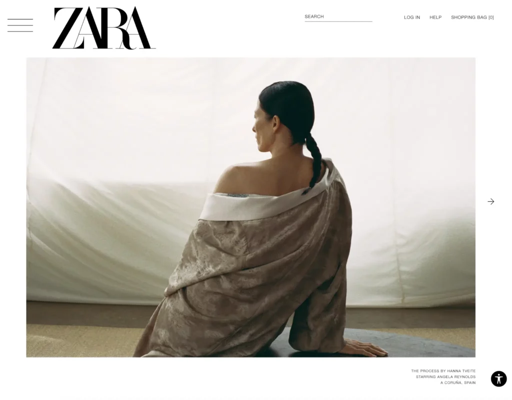
Image credit: ZARA
How to use it
Simplifying your site’s navigation doesn’t mean cutting everything. It’s about organising it better and making sure the essentials are always easy to find. Here are some ways to make that happen:
- Put the most-used links first – Focus on what most visitors actually click, not what you want them to.
- Use icons and labels wisely – On mobile, simple icons with clear text keep things intuitive.
- Hide depth where it’s not needed – Keep secondary filters or niche pages tucked away behind expandable menus.
- Make the search bar prominent – Some visitors prefer to search rather than click through menus, so make it easy to find.
- Test your navigation paths – Watch where users get stuck and cut any unnecessary steps.
A simpler navigation bar gets people to the content they want faster, which usually leads to more sales, sign-ups, or whatever your end goal might be.
8. Dark Mode as a Default Option
What is it?
Dark mode isn’t new, but it’s becoming the standard rather than a bonus toggle hidden in settings. More sites are either launching in dark mode by default or letting users switch with one click.
It’s easier on the eyes for many people, saves battery on certain devices, and, when designed well, just looks sharper.
Why it’s trending in 2025
Most of us spend hours staring at screens every day. A bright white website at full brightness can feel harsh, especially at night or on mobile. That’s why so many apps and operating systems now default to darker palettes. Users have grown used to it, and when a site doesn’t offer it, it feels behind.
Plus, dark backgrounds can make images and text pop when done right, giving designs a cleaner, more modern feel.
Real-world example
ASOS offers a dark mode option across its app. For late-night shoppers scrolling through products, it feels easier on the eyes, keeps the visuals sharp, and reduces fatigue, which helps keep people browsing longer.
How to use it
Adding dark mode to your site isn’t complicated, but it works best when it feels intentional, not like a quick colour inversion. Focus on these:
- Design both versions properly – Don’t just flip colours. Make sure text and visuals work on light and dark backgrounds.
- Offer an easy toggle – Let people switch instantly without digging into menus.
- Match system preferences – Detect if someone’s device is set to dark mode and match it automatically.
- Optimise contrast and readability – Dark mode still needs to be easy to read. Avoid neon text or low-contrast shades.
- Test it at night – A dark theme that still feels glaring will miss the point.
9. Micro-Interactions for User Feedback
What is it?
Micro-interactions are the tiny animations or effects that respond when someone interacts with your site. A button might pulse slightly when clicked… a progress bar could animate as a page loads… even a form field might glow softly when it’s filled out correctly. These details help the user feel confident that the site is working as expected.
Why it’s trending in 2025
Users are so used to polished, app-like experiences that static websites can feel clunky. Small interactive cues make a site feel smoother and more intuitive, guiding visitors through actions without big pop-ups or intrusive alerts. They also help sites feel modern without needing a full redesign.
Real-world example
Spotify uses micro-interactions well in its web player. Play buttons animate gently when hovered over, and track progress bars update with subtle movement, giving the interface a fluid, responsive feel. These touches are small but make the experience feel seamless.
How to use it
The key is restraint. Micro-interactions should make a site feel more responsive, not like a light show. Places where they work well include:
- Buttons and icons – A ripple, pulse, or slight scale effect confirms a click or tap.
- Loading states – Animated spinners or bars reassure users something is happening.
- Forms – Highlights, ticks, or fades when a field is completed correctly.
- Scroll indicators – A subtle bar showing how far through a page you are.
- Menu interactions – Smooth opening and closing animations for dropdowns or side menus.
- Notifications – Gentle fades or slides for alerts instead of abrupt pop-ups.
Used sparingly, these effects make a site feel modern and effortless to use without slowing it down.
10. Bold, Oversized Typography
What is it?
Text is taking centre stage in web design again. More sites are using oversized headlines and bold fonts as a design feature, not just a way to deliver information.
These big, confident type choices often replace heavy imagery, giving pages a cleaner and more modern look while still grabbing attention.
Why it’s trending in 2025
Large, bold typography loads faster than image-heavy designs, which helps sites perform better on mobile.
It also makes content easier to read at a glance and stands out in a crowded feed when shared on social media.
For brands trying to make a statement without clutter, typography-led design is an easy win.
Real-world example
High fashion brands, like Gucci, frequently use full-width, oversized type on landing pages, with short phrases that dominate the screen. It grabs attention instantly while keeping the overall design fast and minimal.
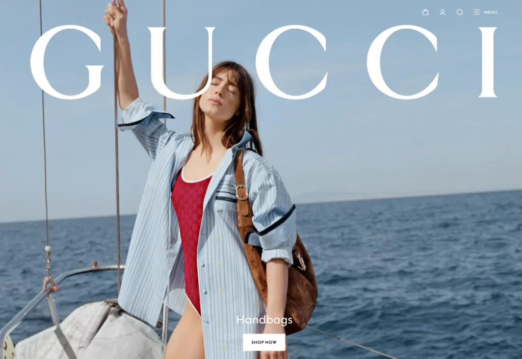
Image credit: GUCCI
How to use it
Oversized typography works best when it feels intentional, not just “big for the sake of it.” A few ways to make it work:
- Pair it with plenty of white space so the design feels balanced rather than overwhelming.
- Use contrasting weights and sizes to create hierarchy and guide the reader naturally.
- Stick to short, sharp phrases – Big text doesn’t work well for long paragraphs.
- Choose fonts that fit your brand – Bold typefaces should reflect your tone, whether that’s sleek, playful, or professional.
- Test legibility across devices – What looks good on desktop can feel too large on smaller screens.
11. Scroll-Triggered Animations
What is it?
Scroll down a site today and you’ll notice something’s changed. Text might fade in as it comes into view. Images slide gently into place. Some sections feel like they’re stacking and shifting as you move. These are animations triggered by scrolling, designed to make a page feel smoother and keep you moving.
Why it’s trending in 2025
Think about how much time you spend scrolling every day — through feeds, through news, through shopping sites. Most of that is passive. Static pages can feel like a wall of content, and people lose interest fast. Scroll-triggered animations break that up. They create a sense of flow, making the experience feel lighter and helping guide you through the content naturally.
Real-world example
Luxury car brands like Aston Martin use these effects on their product pages. As you scroll, the car images shift and scale, features appear dynamically, and the whole page feels like it’s guiding you rather than just showing static blocks of text and pictures.
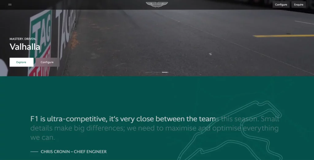
Image credit: Aston Martin
How to use it
The best scroll animations don’t draw attention to themselves, they make the page feel more natural to move through. A few things to keep in mind if you’re adding them:
- Pick your moments carefully – Animate important elements like key headlines or product visuals, not every single piece of text.
- Keep it smooth and fast – Animations should add flow, not slow people down.
- Guide attention – Use motion to highlight features or direct people toward calls-to-action.
- Check it on real devices – A slick animation on a new laptop can stutter badly on an older phone.
- Give people control – Offer a reduced motion option for visitors who prefer a simpler experience.
If the animations feel like part of the journey, visitors will stay engaged. If they feel like a gimmick, they’ll just get in the way.
12. Data-Driven Design Adjustments
What is it?
Websites aren’t being redesigned every year from scratch anymore. Instead, more businesses are making small, ongoing tweaks based on what the numbers say.
Click maps, heatmaps, and user behaviour data show where people get stuck or leave, so pages can be adjusted regularly without waiting for a full rebuild.
Why it’s trending in 2025
Think about how quickly user behaviour shifts. A layout that worked six months ago might be slowing you down now, and most sites don’t notice until sales or leads drop.
Regular, data-driven updates keep a site feeling fresh and performing well without the huge cost of a total redesign. With AI tools making it easier to analyse behaviour in real time, this approach is becoming the norm.
Real-world example
Online booking sites like hotels.com are constantly testing page elements based on user behaviour. Buttons move, layouts shift, and calls-to-action change size, all based on what gets the most engagement. Most visitors won’t notice the tweaks, but they add up to a smoother, more profitable experience.
How to use it
If you’re not testing and adjusting your site yet, you don’t need a full analytics department to get started. Look at the areas where people drop off or hesitate, and start refining from there. A few simple ways to do this include:
- Track where people click (or don’t) – Use click maps to see what’s being ignored.
- Test different versions of key elements – Headlines, button placements, and navigation can all impact conversions.
- Look at bounce rates by page – If people keep leaving one page, figure out what’s slowing them down.
- Optimise forms and checkouts – Small tweaks to steps and layouts often reduce abandonment.
- Make one change at a time – Test, measure, then adjust again so you know what’s actually working.
This approach stops your site from feeling stale, helps you stay ahead of changing behaviour, and spreads the cost of improvement over time rather than in big, disruptive projects.
13. Fluid, Responsive Grids
What is it?
Websites used to rely on fixed grids; rigid layouts where everything sat neatly in rows and columns. In 2025, that’s shifting toward fluid grids that adjust more naturally to any screen size or orientation.
Rather than just snapping between a desktop and mobile view, these grids flow, allowing elements to resize and rearrange so the site feels smooth on everything from widescreens to phones.
Why it’s trending in 2025
Think about how many different screens you use each day. A laptop, a phone, maybe a tablet, even a TV. People expect websites to work perfectly on all of them, and they notice when something feels squashed or broken.
Fluid grids make the experience consistent and natural, which helps keep visitors engaged rather than frustrated.
Real-world example
Portfolio sites for creatives often use fluid grids to display work. Images and text flow seamlessly across different screen sizes, which keeps the site looking polished without manual adjustments for every device.
How to use it
Switching to a fluid grid doesn’t mean a full rebuild. Start by looking at where your layout currently feels rigid, then focus on making those areas more flexible. Here are a few steps worth considering:
- Use flexible units – Swap fixed pixel sizes for percentages or viewport-based sizing.
- Prioritise content hierarchy – Make sure the most important elements stay prominent as layouts shift.
- Test on a wide range of screens – Not just phones and laptops, but tablets and larger monitors too.
- Avoid overcomplicated designs – Simpler grids tend to scale more smoothly.
- Keep load speed in mind – Optimise images and elements so the design stays fast across devices.
- Adjust typography dynamically – Big headlines need to resize so they don’t dominate on small screens.
Getting this right makes a site feel professional and effortless, no matter how someone is viewing it.
14. Layered Depth and Overlapping Elements
What is it?
Websites are moving away from flat, grid-locked layouts. Layered depth uses overlapping images, text, and backgrounds to create a sense of dimension, almost like a digital collage. Done well, it can make a page feel dynamic without relying on heavy animation or video.
Why it’s trending in 2025
Flat design has been the default for years, but it’s starting to feel plain. Visitors want a site that feels modern and visually interesting without being cluttered. Layered elements create depth and hierarchy, helping guide the eye naturally while still keeping the page lightweight and fast.
How to use it
Layered layouts work best when they feel balanced, not chaotic. If you’re planning to use this style, keep these points in mind:
- Use layers to highlight key content – Overlapping elements should draw the eye, not confuse it.
- Keep plenty of negative space – Space helps prevent a busy, cluttered look.
- Make sure it scales well – Overlaps can look messy if they don’t adapt on smaller screens.
- Choose your colours carefully – Strong contrasts help layers stand out without hurting readability.
- Test for accessibility – Ensure text over images remains easy to read for all users.
- Use restraint – One or two layered sections per page can create interest, but overuse will feel chaotic.
The goal is to add depth without making the site harder to use. When done right, it makes a design feel more modern and engaging without sacrificing clarity.
15. Inclusive Colour Palettes
What is it?
Colour choices on websites aren’t just about looking stylish anymore. Inclusive colour palettes are designed to make sure everyone can see and interact with your site comfortably, including people with colour vision deficiencies or sensitivity to contrast. It means thinking beyond brand colours and ensuring your site remains usable for every visitor.
Why it’s trending in 2025
A growing number of users browse with accessibility tools, and poor colour contrast can make a site difficult or impossible to use. Regulations and user expectations have pushed businesses to take this seriously.
At the same time, softer tones, higher contrasts, and balanced palettes often just make a site feel easier on the eyes for everyone, not just those with visual differences.
Real-world example
Marks & Spencer revamped its online design last year to improve colour contrast and readability, especially on mobile. Subtle changes to buttons, text colours, and backgrounds made the site more accessible while still keeping the brand’s visual identity intact.
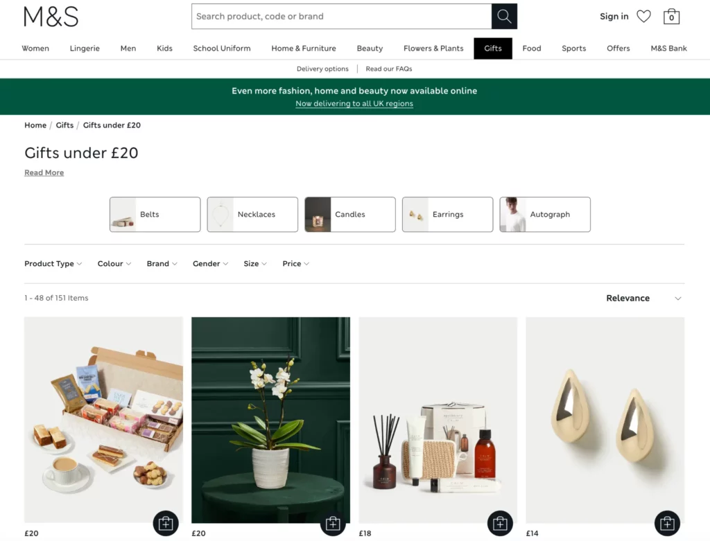
Image credit: Marks & Spencer
How to use it
Making your colour palette more inclusive doesn’t mean abandoning your brand identity. It usually comes down to a few key adjustments:
- Check contrast levels – Make sure text is easy to read against its background on all devices.
- Avoid colour as the only indicator – Use icons or text alongside colour cues for things like error states or buttons.
- Test with accessibility tools – Check your palette using simulators for colour blindness and low vision.
- Stick to a limited palette – Fewer, more deliberate colours are easier to balance for contrast.
- Offer a dark mode version – Helps reduce eye strain for users who prefer lower light displays.
- Prioritise consistency – Repeating colours for the same actions (like all primary buttons) avoids confusion.
A palette that works for everyone doesn’t just meet accessibility standards; it creates a smoother experience for all visitors and often looks cleaner in the process.
16. Video Headers and Backgrounds
What is it?
Instead of static hero images, more sites are using short, looping videos as the main visual when you land on a page.
These aren’t long, autoplaying ads with sound; they’re subtle clips that set the tone, show a product in action, or create atmosphere without requiring the user to click anything.
Why it’s trending in 2025
Attention spans keep shrinking, and a moving visual can grab attention faster than a static image. Videos also tell a story instantly, which helps brands connect with visitors quickly.
With better compression tools and faster loading speeds, these clips no longer slow down websites the way they used to, even on mobile.
Real-world example
Luxury hotels like The Ritz London use short, muted video loops on their landing pages to showcase interiors, views, and experiences. It adds atmosphere straight away and gives visitors a sense of what staying there feels like, without forcing them to hit play.

Image credit: The Ritz London
How to use it
Video headers work best when they’re quick, subtle, and well-optimised. To make them feel polished rather than intrusive:
- Keep clips short and lightweight so they load instantly on all devices.
- Mute and loop videos automatically – Sound-on autoplay is a guaranteed way to lose visitors.
- Use them to show context or mood rather than cramming in too much detail.
- Make sure text is still legible – Overlay colours or gradients if needed.
- Offer a static fallback for users on slow connections or those who disable video autoplay.
- Test performance – Check load times on mobile and older devices to avoid slowdowns.
When done properly, video headers can make a homepage feel dynamic and polished, giving visitors an instant impression of your brand without overwhelming them.
17. Sticky, Contextual CTAs
What is it?
Calls-to-action (CTAs) used to be static; a single button at the top or bottom of a page, hoping people would find it. Now, more sites are using sticky CTAs that follow the user as they scroll, or even adapt based on what part of the page they’re on. Instead of one generic “Contact Us” button, the CTA changes to match the content someone is reading or the section they’re in.
Why it’s trending in 2025
People don’t always read an entire page before deciding to act. If your only CTA is buried at the end, you’re losing clicks.
Sticky, adaptive CTAs make it easy for someone to take the next step without having to scroll back up or hunt for the right link.
They also help keep key actions front and centre without feeling pushy, because the button can be small, subtle, and relevant to what’s on-screen.
How to use it
If you want to add sticky or contextual CTAs to your site, a few tips help make them effective rather than annoying:
- Keep the design subtle – A small, non-intrusive bar or button works better than a giant banner.
- Match the CTA to the content – Change the text based on what the visitor is reading (e.g., “See more details” on a service page, “Book now” on a pricing section).
- Test placement – Bottom corners often work best so the CTA is visible but doesn’t cover content.
- Avoid constant pop-ups – A static sticky CTA is less disruptive than repeated modal pop-ups.
- Track clicks and engagement – Adjust the design or behaviour if people are ignoring it or finding it distracting.
18. Serif Fonts Making a Comeback
What is it?
For years, minimalist sans-serif fonts dominated web design. Now, serif fonts, the ones with small decorative strokes on the ends of letters, are finding their way back into headlines and even body text.
They add character and a more editorial feel, helping sites stand out in a sea of similar, stripped-back typography.
Why it’s trending in 2025
Minimalist design has started to feel a bit cold and samey. Brands are turning to serif fonts to inject personality and warmth into their sites. They can feel sophisticated and timeless, which helps create a distinctive look while still keeping things clean.
Pairing serif headlines with sans-serif body text is especially popular, balancing style with readability.
Real-world example
Luxury brands like Burberry have leaned into serif fonts online, using them in bold, oversized headlines while keeping body text simple. It gives the design a classic, premium look without making the site feel old-fashioned.
How to use it
Serif fonts can give your site a distinctive look, but they need to be used carefully to avoid hurting readability.
- Limit them to key areas – Headlines, pull quotes, and featured sections work best.
- Pair them with simpler fonts – Use sans-serif for body copy to keep it easy to read.
- Check readability on small screens – Some serif fonts can blur at smaller sizes.
- Choose modern serif styles – Look for cleaner, high-contrast versions that feel fresh.
- Make sure they fit your brand – They work best for businesses aiming for a premium, editorial, or creative feel.
19. Interactive Storytelling Sections
What is it?
Instead of dumping all the information on one long static page, more sites are turning sections into guided stories.
As you scroll, click, or hover, the content unfolds: images appear, text transitions, and details build step by step. It feels less like reading a brochure and more like being walked through something.
Why it’s trending in 2025
Think about your own browsing habits. Long paragraphs of static text are easy to skip. Interactive storytelling breaks content into pieces, keeps people curious, and makes the experience feel more like a conversation than a lecture. It’s also a clever way to present complex information without overwhelming someone all at once.
Real-world example
Beats By Dre uses this storytelling flow on its product launch pages. As you scroll, visuals shift, text fades and slides into view, and the narrative unfolds section by section. It feels immersive, more magazine shoot than typical product page.

Image credit: Beats By Dre
How to use it
Interactive storytelling works best when it feels smooth. A few tips to make it effective:
- Keep each step short – Visitors should get one clear point or visual per scroll, not a wall of text.
- Use motion sparingly – Simple fades, slides, or reveals are usually enough to keep attention.
- Pair text with visuals – Each section should feel complete without overwhelming the user.
- Show progress – Markers or subtle prompts can help people know how far along they are.
- Optimise performance – Heavy animations will kill the effect if the page lags, especially on mobile.
- Test user flow – Watch where people lose interest and tighten those sections.
20. Gradients and Colour Transitions
What is it?
Flat colour blocks are fading out, with gradients and smooth colour transitions taking their place. These aren’t the loud, neon blends of years ago; they’re softer, more deliberate shifts between two or three tones that add subtle depth and warmth to a page.
Why it’s trending in 2025
Flat design can feel plain, especially on big screens or in dark mode. Gradients create visual interest without needing extra graphics, and they make key sections stand out. They also allow brands to refresh their design without abandoning their established colour palettes.
Real-world example
Viedoc, a clinical technology company, pairs minimal, modern typography with soft, subtle gradients across key landing pages. The effect adds visual interest and structure without sacrificing clarity or performance.
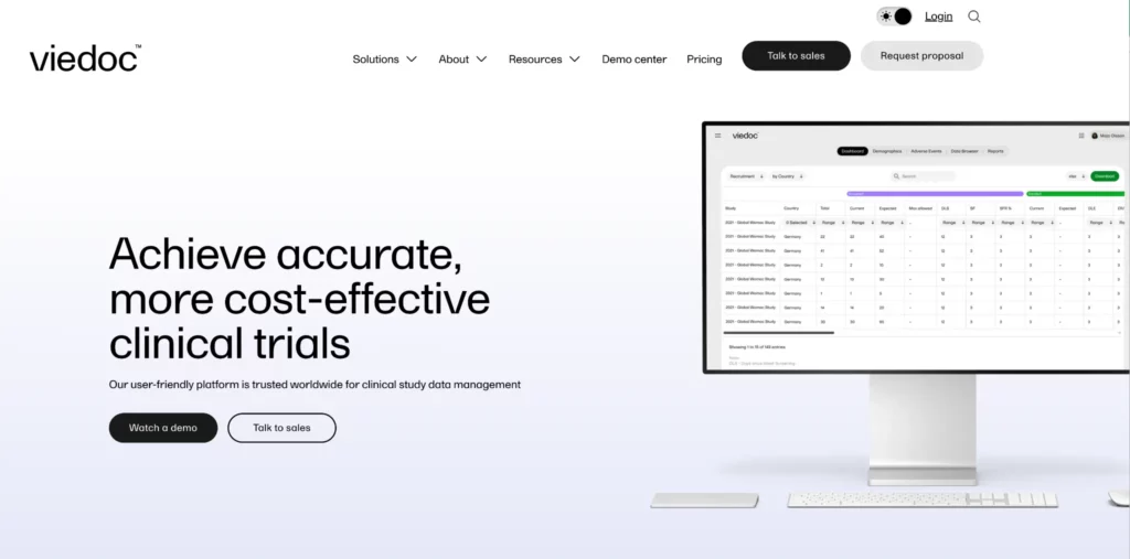
Image credit: Viedoc
How to use it
Gradients need to be subtle and intentional, otherwise they’ll overpower the design. Focus on these tips:
- Stick to two or three shades – complex gradients can look dated and messy.
- Use them behind content blocks or CTAs – to make key areas stand out naturally.
- Pair with simple typography and imagery – gradients should complement, not compete.
- Test them in dark and light modes – some blends can clash when the background changes.
- Optimise file sizes – heavy gradients can slow down mobile performance.
- Apply them selectively – one or two gradient sections add impact, covering the whole site will look excessive.
When used with restraint, gradients can give your site a fresh, modern edge without hurting readability or speed.
Staying Ahead of the Curve
Modern website design trends shape how visitors experience your brand, how easy it is for them to find what they need, and whether they stick around long enough to take action.
If your site hasn’t been touched in a while, it’s worth looking at these shifts carefully. Even adopting two or three of them can make a huge difference in how people interact with your pages.
To discuss which of the latest web design trends are relevant to your business and how to make your site feel more alive, get in touch with the friendly team at Appnova today. Contact us today on +44 20 7384 3324 or send an email to [email protected] and we’ll get back to you as soon as possible.
FAQs
Which web design trend will impact SEO most in 2025?
Accessibility-focused changes are set to have the biggest effect. Search engines increasingly reward sites that meet accessibility standards, from proper heading structures and alt text to fast, mobile-friendly layouts. Sites that invest here often see SEO improvements alongside better user engagement.
How do I choose the right trend for my brand?
Start by looking at your audience and goals. If you sell products online, features like immersive 3D views or interactive storytelling can drive engagement. If you’re service-based, accessibility, faster load speeds, and clear navigation might matter most. The key is to pick changes that make your site easier to use and keep it aligned with how people browse today, rather than following every trend for the sake of it.


Subscribe To Us
Contributors
Categories

0.Comments