9 Secrets to Designing a High-Converting Luxury Website
In luxury, a website is part of the brand experience. It should feel like walking through your flagship store: elegant, deliberate, and deeply sensory.
For many high-end customers, your website is the first touchpoint with your brand. The way it looks, moves and speaks communicates just as much as your products do.
And that’s where the challenge lies: how do you blend exclusivity and emotion with something as practical as conversion? A luxury website must sell without ever looking like it’s trying to. It’s about guiding, not pushing. Seducing, not shouting.
When done right, the digital storefront becomes a living expression of your brand’s values, one that makes visitors feel they’re in the right place before they even click “Add to bag.”
So, with that being said, we’ve put together a collection of the best luxury website design tips to give you a helping hand.
Understanding the Luxury Consumer Online
Before we take a look at some premium website design ideas, we first need to understand the luxury online consumer. Luxury customers don’t browse the way everyone else does. They take their time. They notice details. They care about how a site makes them feel before they even look at price or specs.
They expect elegance, but also ease; pages that glide rather than load, imagery that invites a pause, words that sound like they were written for them. Anything clunky or cluttered instantly feels off-brand.
They’re also curious. They’ll open ten tabs, read the brand story, check materials, and look for small signs of authenticity. What reassures them isn’t a discount or a timer; it’s precision, transparency, and a sense that your brand speaks their language.
So while most eCommerce is built to push, luxury is built to pull. It’s slower, more deliberate, and more emotional. A well-designed site gives visitors room to explore because the longer they stay, the more they believe.
The 9 Secrets to Designing a High-Converting Luxury Website
Every great luxury website balances beauty and precision. It seduces through aesthetics, but converts through ease. These nine luxury website design tips sit at that intersection, where design becomes desire, and desire quietly turns into action.
1. Design for Emotion Before Function
Luxury begins with feeling. Visitors should sense something distinctive before they even know why.
The design’s job is to stir emotion first. Logic can come later.
How to do it well
- Pace the experience. Avoid instant gratification. Use subtle motion, layered visuals, and breathing space so discovery feels gradual.
- Engage the senses. Texture photography, natural light, soft transitions… these evoke tactility even through a screen.
- Edit language. Luxury copy is quiet, not shy. It says just enough to leave the reader curious.
Expert note: If users pause rather than scroll, you’ve succeeded. Stillness is often a stronger signal of engagement than clicks.
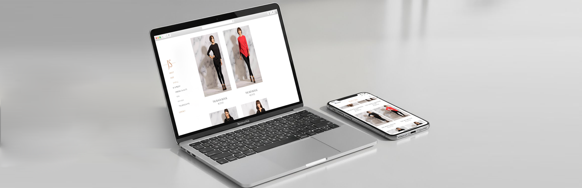
When Appnova redesigned IIUVO’s site, we focused on tempo: slow fades, monochrome imagery, and fluid transitions that mirrored the scent’s rhythm. Each scroll felt intentional, echoing the brand’s calm confidence.
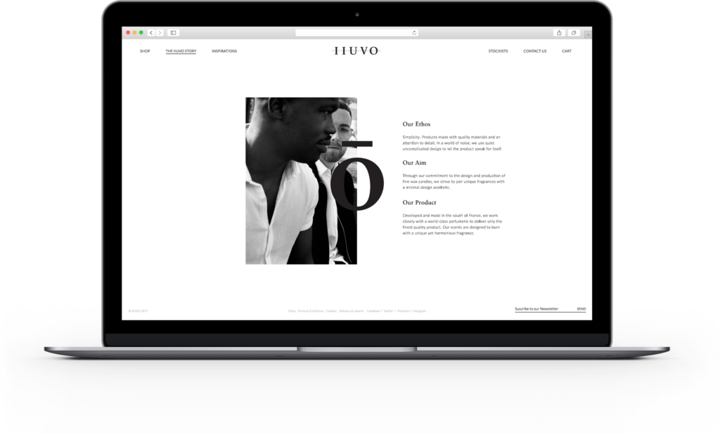
Image Credit: IIUVO
Metrics to watch include dwell time above the fold, interaction rate with hero modules, and scroll completion depth. These are all indicators of emotional engagement before purchase intent.
2. Navigation That Feels Like Guidance
Great navigation doesn’t just help people find things; it makes them feel looked after. For a luxury user, that sense of curation is everything. They expect clarity, calm, and the confidence that someone has already done the editing for them.
- Curate, don’t catalogue. Keep menus short and purposeful. Five well-chosen categories will always outperform fifteen generic ones.
- Group by mood, not by department. “New In”, “Icons”, or “Stories” communicate more than “Products” or “Shop”.
- Design the tempo. Let dropdowns appear with a gentle delay; give the eye a fraction of a second to land before the next option.
- Use hierarchy as storytelling. Each level deeper should feel more personal, like moving from the shop window to a private room.
Hermès does this beautifully. Its top menu is simple and easy to follow, with each click opening a world of colour, craftsmanship, and narrative. The structure feels intentional. You’re guided, not dumped into a database.
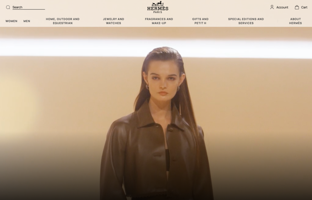
Image Credit: Hermès
Practical touchpoints
- On desktop, use micro-motion to signal depth rather than sprawling megamenus.
- On mobile, prioritise one-handed comfort; if a thumb can’t reach it, it’s in the wrong place.
- Add contextual signposts (“Discover the atelier”, “Explore the craft”) at key points to guide exploration without pressure.
The goal isn’t for users to know where they are. It’s for them to never feel lost.
Metrics to watch include navigation dwell time, menu exit rate, and secondary clicks from the same session.
3. Use Motion as a Signature, Not a Decoration
Movement catches the eye, but meaning holds it. In luxury design, animation shouldn’t entertain; it should express refinement. A subtle hover, a gentle fade, a scrolling parallax that feels more like breathing than bouncing. These details build trust by showing care.
When motion works
It directs attention. A slow reveal draws the gaze to a product feature or call to action without shouting for it.
It signals precision. Smooth transitions tell users: “We’ve thought this through.”
It deepens rhythm. Motion can slow the tempo of browsing, which is ideal for brands that want to be savoured, not skimmed.
Bulgari’s online boutique uses motion sparingly; jewellery gleams with a controlled fade, menus glide softly, and product tiles respond to hover with grace, not gimmick. The experience mirrors the craftsmanship behind the product.
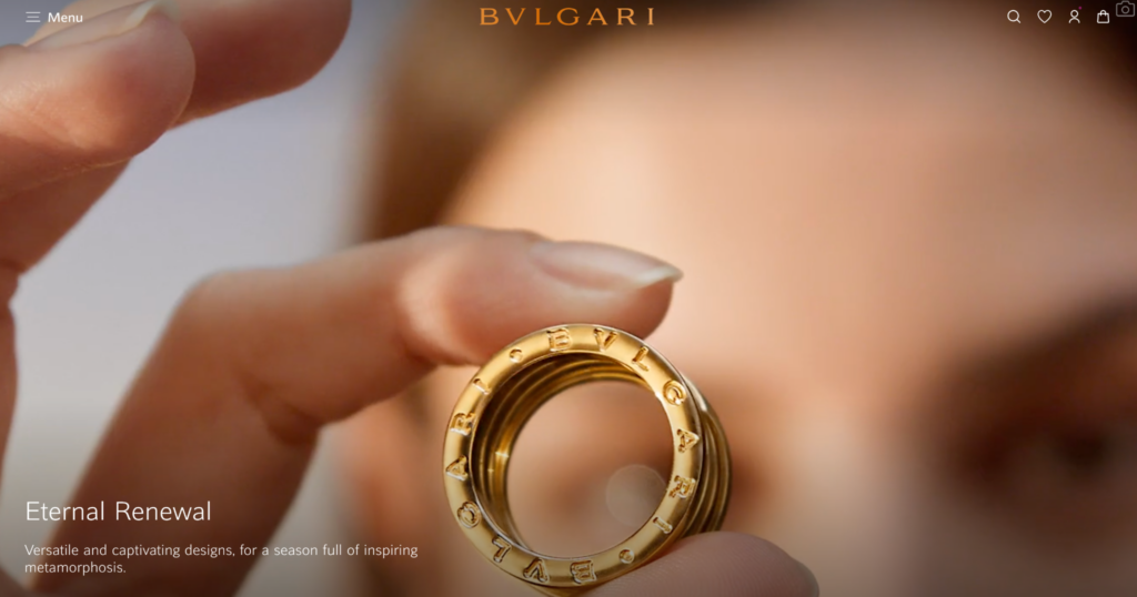
Image Credit: Bulgari
Quick wins
- Use ease-out curves at 200–300ms for calm, graceful transitions.
- Keep elements anchored; avoid jittery slides.
- Limit to two animation styles per page for consistency.
Watch for input delay (motion should never block interaction) and scroll performance (luxury loses credibility when it stutters).
4. Turn Product Pages Into Experiences
Most eCommerce sites see a product page as an endpoint. Luxury treats it as an encounter, a digital equivalent of being shown an item in-store. The goal isn’t to display the product; it’s to create context, confidence, and desire.
The essentials
- Lead with emotion. Start with imagery that tells a story: a watch on a wrist, light glinting on fabric.
- Unfold the details. Let information appear progressively: first the craft, then the material, then the service.
- Mix proof with poetry. Pair technical detail with human language. “Italian nappa leather, hand-dyed in Tuscany” says more than “100% leather.”
- Support decisions quietly. Add comparison, size guides, or 360° rotation, but only when asked.
Rimowa’s product pages are almost architectural in their restraint. The imagery dominates, yet every layer of detail, such as the material, origin, and repair service, is available with a single click. It’s a lesson in how luxury sells through reassurance, not persuasion.
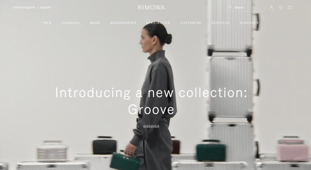
Image Credit: Rimowa
Typical eCommerce → Luxury Reframe
“Add to Cart” → “Add to Your Collection”
“Free Returns in 30 Days” → “Returns arranged within 30 days — on us.”
“Shipping calculated at checkout” → “Worldwide delivery, duties included.”
Luxury customers don’t need convincing; they need confidence. The product page is where you prove you deserve it.
5. Write Like a Human, Sound Like a Brand
Words are design. The wrong tone can undo the most beautiful layout in seconds.
In luxury, language does more than inform. It signals belonging. It tells your audience: you’re in the right place.
The Luxury Copy Playbook
1. Fewer adjectives, more intent.
Luxury writing doesn’t decorate; it defines. Replace “beautiful craftsmanship” with “hand-stitched in Florence.” Facts feel truer than praise.
2. Confidence in restraint.
Short sentences suggest control. Long ones work when rhythm demands it. Alternate between both so the text breathes.
3. Precision over poetry.
Be lyrical in headers, factual in product details. The contrast builds credibility.
4. Service through micro copy.
At checkout, use language that reassures. “Duties included” carries more trust than “Calculated at checkout.”
5. Don’t imitate heritage, embody it.
A new brand can sound timeless by being precise, not by recycling the language of maisons. Speak with quiet conviction, not nostalgia.
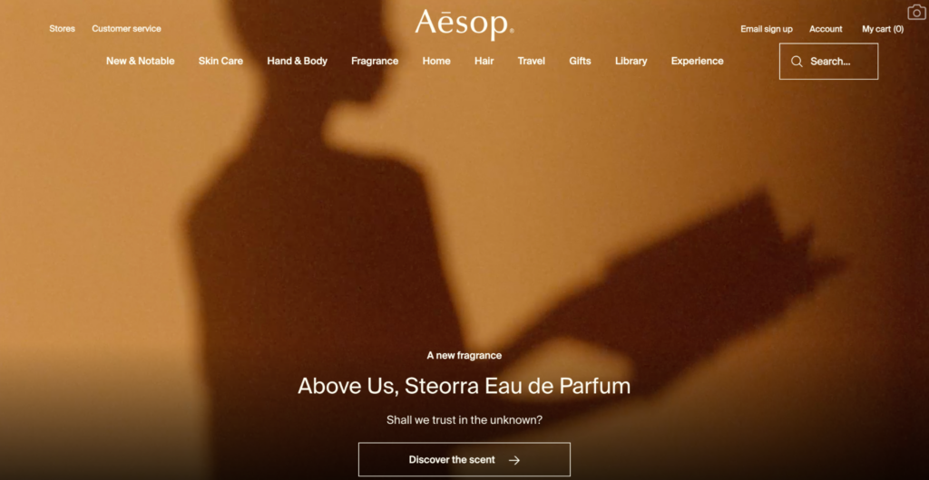
Image Credit: Aesop
Aesop is a masterclass in tone. Every line, from product names to help text, feels intentional. Calm, articulate, and a touch eccentric. It’s not selling skincare; it’s curating a worldview.
Key takeaway: Good luxury copy is about effortlessness. You should never feel the writer working for your attention.
6. Personalisation That Feels Like Service
True luxury is personal. It remembers, anticipates, and adapts, without ever intruding. The same applies online. The best luxury websites personalise with manners.
Personalisation shouldn’t feel algorithmic; it should feel like a concierge quietly taking note. Subtle gestures go further than data-driven noise.
What this looks like in practice
Curated recommendations that feel human: “Complete your ritual” or “You might also love.”
Dynamic storytelling. Change homepage imagery based on previous browsing (not their postcode).
Clienteling features that serve, not stalk; wishlists, care reminders, reorders, and early access for loyal customers.
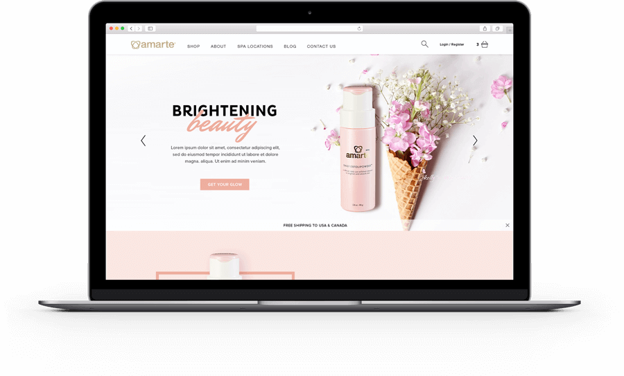
Image Credit: Amarte
When we worked on Amarte, a luxury skincare brand, personalisation meant calm precision, not push. Returning customers saw their preferred product range first, along with subtle educational prompts on ingredients they’d previously viewed. No intrusive pop-ups, no shouting banners, just tailored relevance within the brand’s serene tone.
Remember: Luxury personalisation isn’t about knowing who they are, it’s about remembering how they like to be treated.
Quick diagnostic
If your site ever says, “We noticed you might like…” – it’s gone too far. Replace it with the language of discretion: “Recommended for your collection” or “Designed to pair beautifully with…”.
7. Mobile Is the New Flagship
The first visit doesn’t happen on a desktop anymore. It happens in someone’s hand, often in motion. If your mobile site feels like an afterthought, so does your brand.
- Gesture, don’t cram. Think thumb-zone, not grid. Elements should fall naturally under the thumb; smooth, predictable, and forgiving.
- Simplify motion. Large transitions that feel elegant on desktop can feel clumsy on mobile. Trim the choreography.
- Protect imagery. Mobile luxury depends on clarity; sharp, full-bleed photos that don’t pixelate or crop mid-product.
- Respect quiet. Limit pop-ups, overlays, and prompts. On small screens, silence is the new premium.
When touch feels good, trust follows. People equate frictionless with flawless.
One of the best luxury website design examples from a mobile perspective is Bottega Veneta. Bottega Veneta’s mobile experience is a masterclass in restraint: heavy imagery, light interface, and scrolls that feel as smooth as their leather looks.
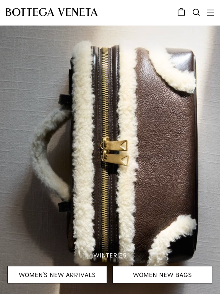
Image Credit: Bottega Veneta
Metric to watch: Mobile checkout conversion. It’s the truest reflection of how well the experience holds up when luxury meets reality.
8. Checkout That Disappears Gracefully
The luxury checkout shouldn’t feel like admin. It should feel like confirmation; quiet, swift, and reassuring.
How refinement works here
- Strip it back. One page if possible. No marketing boxes, no distractions.
- Reassure throughout. Show shipping, duties, and returns inline, not hidden behind tooltips.
- Use tone as service. Replace mechanical labels (“Billing address”) with softer cues (“Where shall we send your order?”).
- Keep the brand alive. Typography, colour, and spacing stay consistent; luxury dies at the sight of a generic form.
Look at Dior’s online checkout: calm tones, large breathing space, and microcopy that reads like concierge dialogue. You never wonder what’s next; you simply glide forward.
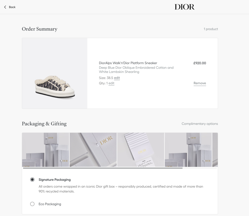
Image Credit: Dior
Small luxury, big impact
Add a “Thank you” page that feels personal. A gentle animation, a note about packaging, or a brief invitation to explore aftercare; small details that turn transaction into memory.
Measure step-level drop-off, form error rate, and repeat purchase from the same device… the quiet signals of trust built through simplicity.
9. Design for Culture, Not Just Conversion
Luxury isn’t universal. What feels exclusive in Paris can feel distant in Seoul. A high-performing global site understands that design speaks differently in every market, and still finds one consistent voice.
A reflective truth
Luxury has always adapted quietly. The best digital brands don’t chase trends; they translate their world for each audience with respect and precision. That means localising without losing character. Currencies, scripts, payment methods, even colour choices… all tuned to context but still unmistakably “you.”
Global doesn’t mean generic. The art lies in holding your aesthetic steady while letting your experience flex.
The expert’s checklist
- Local payment and duties are made explicit. No hidden friction.
- Script and language tested for spacing, tone, and typographic grace.
- Regional assortment curated. Avoid “not available” moments.
- Design choices reviewed for cultural meaning: numbers, gestures, imagery, colours, and so on.
Luxury design that respects culture feels instantly more human, and that’s what converts quietly but powerfully.
Common Mistakes Luxury Brands Should Avoid in Website Design
Sloppiness is unforgivable in the world of luxury! Just one, small misstep can break the spell, whether it’s a word that’s out of place or a banner that’s too loud. These are the patterns that quietly chip away at elegance online.
1. Overdesigning the Experience
It’s tempting to throw everything in: animations, transitions, textures, and effects. But real luxury breathes. When the design starts to show off, it stops feeling confident.
Rule of thumb – If an element exists just to prove effort, remove it. Restraint is the highest form of craft.
2. Confusing Silence with Emptiness
Minimalism isn’t the absence of design; it’s the presence of control. Some brands equate “clean” with “blank” and end up with sterile, forgettable pages. Luxury minimalism needs warmth: depth in photography, tactility in typography, and light in movement.
Quick fix – Add small sensory anchors, such as grain, natural shadows, and gentle transitions. Quiet doesn’t have to mean cold.
3. Shouting Through CTAs
“BUY NOW” in all caps kills the mood. Users know what a button does; you don’t need to yell it at them.
Use language that aligns with tone:
“Discover the Collection”
“Add to Your Ritual”
“Explore More”
Small words, softer edges. Same intent, different energy.
4. Neglecting the Mobile Experience
Still treating mobile as a simplified version of desktop? That’s not refinement, that’s regression.
Your mobile design is your brand for most users. If it’s heavy, glitchy, or scaled down instead of thought through, you’re telling customers their time isn’t worth your effort.
Ask yourself, would your mobile site still feel premium if someone saw only that? If the answer’s no, start again.
5. Ignoring Storytelling in Favour of Specs
Specs explain; stories persuade. When a luxury site jumps straight from headline to “100% leather, made in Italy,” it misses the why. The why is what people pay for: the lineage, the maker, and the philosophy.
Add narrative layers, such as short journal entries, behind-the-scenes imagery, or a simple line of craft context above your add-to-bag. It’s proof of value.
6. Forgetting the Human Behind the Screen
Luxury UX can become so obsessed with polish that it forgets people. Forms with too many steps. Pop-ups that assume impatience. Checkout screens that talk like robots… Remember, even your wealthiest user just wants clarity and courtesy.
A simple test – Read your microcopy aloud. If it sounds like something your sales associate wouldn’t say in store, rewrite it.
Future Trends in Luxury Website Design
Where other sectors chase novelty, luxury quietly edits, refines, and sets the rhythm. The next wave of website design is about restoring depth and meaning to digital experiences.
1. From Data to Intuition
Personalisation has been reduced to algorithms. But luxury is about perception. The future lies in understanding how someone likes to experience your world.
A site that recognises browsing tempo, aesthetic preference, or how long someone pauses on a craft story, that’s true digital service.
Not “Recommended for you.” More “Welcome back, shall we continue where you left off?”
Luxury will use data to refine emotion, not replace it.
2. Immersion That Knows When to Stop
VR, AR, 3D… all powerful, all dangerous in the wrong hands. The future isn’t about more immersion. It’s about knowing when to stop.
Think of the digital boutique as a stage: the lighting, the silence, the intimacy of discovery. A virtual salon that feels personal. A product you can almost touch, but never too long, never too much. The secret? Rarity. When everything is interactive, nothing feels special.
3. Sustainability as Aesthetic
Sustainability is part of the luxury visual language. It’s seen in slower transitions, natural textures, muted colour palettes, and words that sound like care, not compliance.
Brands are learning that responsible design doesn’t dilute prestige, it defines it. The future of luxury won’t shout eco-friendly; it’ll look and feel that way.
4. Editorial Commerce
Luxury websites are becoming cultural platforms. Product pages now sit beside essays, videos, and creative collaborations. It’s no longer “content vs. commerce” — it’s one continuous story.
This approach builds trust before the transaction. Visitors linger, explore, and absorb the brand world before ever reaching checkout.
When inspiration and purchase share the same page, conversion feels like curiosity fulfilled.
5. The Return of Human Luxury
Among all the AI tools and automations, human tone will become the new marker of exclusivity. Brands that sound personal, write with restraint, and design with empathy will rise above the noise.
Expect quieter typography. Softer transitions. More space for words that sound real.
The luxury site of the future won’t impress you with features, it’ll disarm you with calm.
Technology may power it. But humanity will define it.
Crafting Digital Desire
So there you have it: nine key website design tips for luxury brands. Remember, a luxury website is a living expression of how your brand makes people feel.
When it’s done well, every page becomes a conversation between craftsmanship and technology — a moment of trust dressed as design.
Luxury online isn’t about shouting louder, adding features, or chasing algorithms. It’s about stillness, rhythm, and empathy.
The goal is simple: make the visitor feel something rare, that quiet certainty that they’ve arrived somewhere made for them.
Because in the end, luxury design isn’t what you show. It’s what you withhold and how gracefully you do it.
Frequently Asked Questions
What really makes a luxury website different from any other eCommerce site?
Luxury sites trade on emotion, not efficiency. They’re designed to build belief before conversion. Every detail, from copy and motion to even white space, is used to create belonging, not just a sale.
How important is mobile optimisation for luxury brands?
Essential. For many customers, mobile is the brand. The best sites feel effortless on a small screen: fast, tactile, beautifully paced. Anything less immediately feels off-brand.
Should luxury sites focus more on visuals or content?
Both, but in balance. Imagery seduces; words reassure. The interplay of the two is what creates desire with depth.
What role does personalisation really play?
Done right, it feels like service. The goal isn’t to know everything about your customer; it’s to remember just enough to make them feel recognised.
Can smaller luxury brands compete with global names online?
Absolutely. Big doesn’t always mean better. Smaller brands can move faster, tell sharper stories, and design experiences that feel truly bespoke. Intimacy is a luxury the giants can’t easily replicate.


Subscribe To Us
Contributors
Categories

0.Comments