Grid-based design – a brief history
The grid has been around for centuries. It’s been more than 500 years since the invention of printing press, and around 300 years since the industrial revolution. Throughout those significant periods in history, grids have been vital in many design movements (though ‘grids’ had not been even discussed till the mid 20th century). From religious texts to urban planning, the concept of grids has always been the foundation of design process.
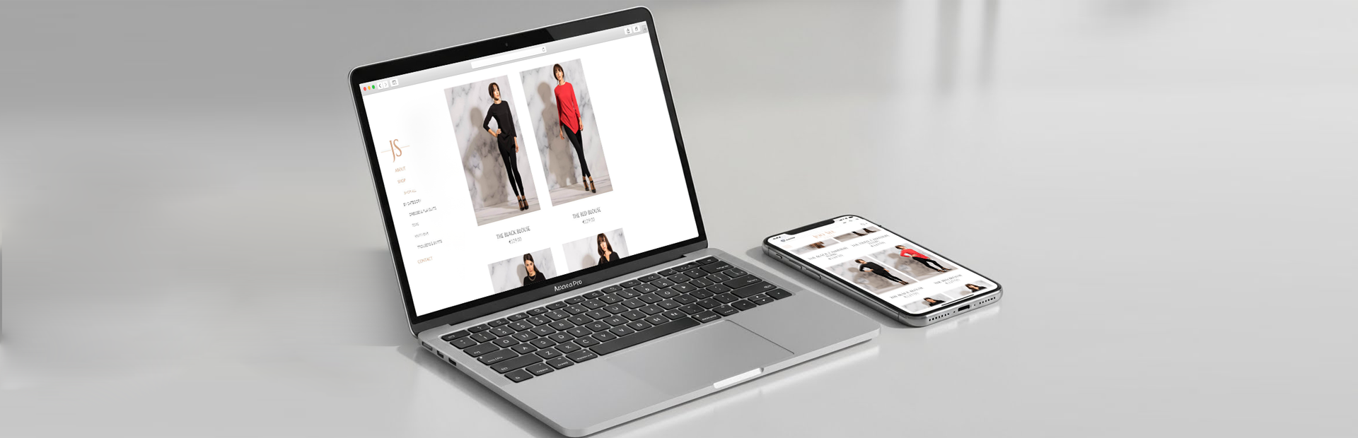
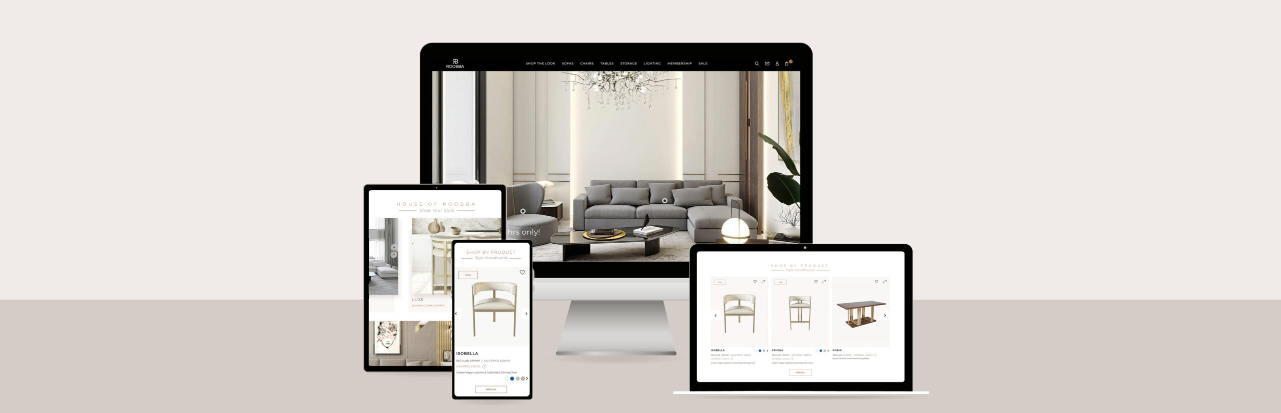
Today it is, as ever, ubiquitous in our society. With a bunch of CSS-based grid frameworks available (see here), it has become much more efficient for designers to build and design beautiful responsive site layout with greatly reduced development time.
With its clear purpose and goal, grid is a popular and smart design choice for many website projects. Thinking grids means thinking rationally. It provides directions for the optimum visual and content hierarchy, and therefore creates a seamless user experience for the end users.
The benefits of thinking grids
While the benefits of using grid-based design are multifaceted, ranging from psychological, functional to aesthetic perspectives, it is particularly instrumental in terms of UX for the following aspects.
Consistency
Needless to say, the vitality of seamless user experience lies in consistency. As UX Magazine says, ‘people rely on consistency and past experience for fast decision making.’ On the other hand, inconsistencies often cause confusions and delays, and on some conditions, undesirable mistakes. Hence visual consistency is crucial to process information, make a judgement and take the following action – and much of those happen intuitively. A lack of consistency deprives the users of familiarity. Try to imagine your local supermarket where you shop regularly. You remember where to find eggs and milk. But what happens if they reshuffles their shelves, changing the layouts completely? That will inevitably convert a familiar place into a maze.
Legibility
Similarly, grids also provide guidelines for web content with clarity and readability. Again from UX Magazine, it ‘establishes a modular structure that allows layout variations without affecting readability and consistency’. One of the top reasons why designers utilise a grid is to keep the web content aligned and organised. Most assuredly, the key to a clean web design lies in alignment. And a grid system makes sure that designers are setting a structure for themselves to align elements against one another to create an ordered layout. This is particularly the case when it comes to content-heavy web pages as keeping content within grids reduces users’ efforts to gloss over and process the most necessary information.
Grids are a perfect solution to keep the otherwise cluttered content balanced and neat.
Does it compromise creativity?
Despite these benefits, some argued that truly captivating visual work are often produced from thinking outside the existing rigidity (via A List Apart). Contrasting Arizona’s grid-plan city and London’s spirals/circles-centered city, the author highlights the advantages of a more spontaneous design. Yes, grids are more easy to get around. But it also ‘lacks a vibrant center’, ie, an alternative neighbourhoods and unique street cultures.
If we use that same metaphor on web design, does that mean grids are restraining creativity too? Well, not necessarily.
As Mark Boulton has once said,
‘Grid systems can facilitate creativity by providing a framework and already answer some designers’ questions such as ‘where should the folios go’, ‘how wide should the measure be?’ etc. A well designed grid system will go some way to answer these questions and more.’
The beauty of grids is not only their consistency, but also their fluidity and flexibility. They are increasingly functional and flexible to adapt to a variety of designs, says Design School. Using grids doesn’t always mean a web layout which is nothing but columns. In fact, grids can also help designers take different angles. As exemplified by the same source, ‘grids can work just as effectively on a diagonal axis as they can on a horizontal or vertical one.
Whether you choose one column or ten columns, thinking grids let you keep your overall look and feel balanced, whilst offering consistency and readability at the same time.
Regardless of the long history, grid-based approach is still ‘in its infancy’ when it comes to interactive web design. That also means there’s a plenty of space to explore and improve.
What do you think?
Appnova is a digital agency specialising in web design, UX, e-commerce, branding, digital marketing and social media.
Keep following us on Twitter @appnova and “like” us on Facebook for useful news and tasteful digressions about geeky stuff.


0.Comments