20 Fashion eCommerce sites that Ooze Luxury
In this digital age, luxury brands are investing more than ever in their online marketing efforts. From cutting edge design, to emotive videos, online magazines, super high-quality lifestyle imagery and more, the crossover between online and offline media has never been closer.
Fashion e Commerce at the forefront of online retail
Amongst the most innovative clients are those in Fashion eCommerce at the luxury end of the market, creating online user journeys that are pixel perfect, allowing their customers to see, feel and almost touch the products from their web based device.
As a leading digital agency in London, we’ve taken window shopping to a new level and scoured some of best luxury fashion eCommerce stores on the market, that are right here on our doorstep, to showcase what makes them stand out from the thousands of ‘ordinary’ eCommerce websites.
Our Top 20
No. 20
Whilst Herve Leger offer a unique shopping experience that creates a sense of luxury, there is an inherent problem here that needs to be fixed. The website is not mobile friendly. As on 21st April 2015 – Google ran an update that gives priority to mobile enabled websites to mobile users. In the world of fashion, this is something that should be sorted quickly to help Herve Leger improve their rankings.
“…in order for a site to be considered mobile-friendly, its text has to be readable without tapping and zooming, its tap targets need to be spaced out appropriately, and the page avoids unplayable content or horizontal scrolling.” Source: http://techcrunch.com/2015/04/21/googles-mobile-friendly-update-could-impact-over-40-of-fortune-500/
No. 19
The heritage luxury brand offers a slick and intuitive mobile experience with a homepage design “to die for” but we feel that this doesn’t quite come across well on their shopping pages, with a tight grid that restricts the page width.
There are also inconsistencies with product imagery, with some shots utilising a white background, whilst others are shot in different lights.
No. 18
The Gucci Website offers a slimline header and footer – ensuring maximum size on the page for their beautiful lifestyle imagery. The website offers a magazine style shopping experience with a smart slider for viewing the various different products – it looks and functions great but causes the user to click many times to view the range.
No. 17
Jimmy Choo dare to be different, opting to use beautiful white cut-out imagery against lively background imagery. In so many cases, we’ve seen it look disastrous, but Jimmy Choo pull this off with relative ease! Everything about the website oozes luxury, with a slick shopping experience, imagery that just screams “buy me now”, even the transitions on scrolling through the catalogue are slick, adding to that feel of quality. Something as simple as changing the background imagery (Pink for the ladies, Blue for the guys) just works so effortlessly well – a fantastic website design.
No. 16
Fendi deliver an incredible yet minimalistic online shopping experience. The subtle use of bright colours, the unusual tiered double left-hand navigation and a product zoom that takes you closer than you could ever get in real life is just genius!
No. 15
Whilst not strictly ‘fashion e commerce’ (you can’t buy online) Chanel deliver a user experience that will send you straight out to the high street. Slick imagery, impressive zoom functionality, and a borderless homepage screams luxury.
No. 14
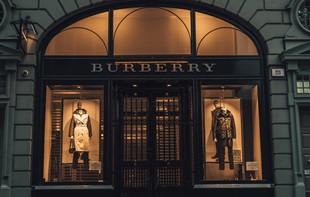
From the outset, the Burberry website offers a slick and rich UX. It’s the little details that make the Burberry website one of our favourite fashion eCommerce websites on the internet today. The small images to showcase the check patterns on the catalogue page, the subtle fonts, the loading transitions, the consistency of the imagery, the greyed out product information that is there, but not overpowering. A fine example of a luxury fashion website.
No. 13
The Moncler website, effectively showcases their range of designer coats using a slick and minimalistic eCommerce website. Unlike most other eCommerce websites, Moncler opt to use a black background for which to showcase their imagery which works exceptionally well. Whilst this is great for Moncler, larger eCommerce websites beware, all of those large PNG images with no background can lead to page loading issues.
No.12
Wow, what an amazing website Harvey Nichols have. It’s light, bright and in season which is perfect for selling fashion products. Like many of the sites we’ve reviewed, the Harvey Nichols website offers a slimline header and footer, maximising the on screen size of their product and lifestyle imagery. The bright colour palette throughout the website draws the users’ eye to key focus content, but also looks great and contrasts perfectly against the black and greys undertones!
No. 11
The Marni website, breaks the norm, with a unique full image homepage design and left-hand navigation. The navigation menu is entirely transparent allowing them to show even more of their amazing imagery. In contrast, the product pages are the perfect platform for their brightly coloured and unique products, opting again for a transparent navigation which allows the products space to breathe.
Our Top 10 Fashion eCommerce Sites and why…
No. 10
http://www.viviennewestwood.com
Vivienne Westwood offer a simplistic and clean shopping experience. The menu on both the category and product pages seamlessly disappears creating maximum amounts of white space, allowing the products to shine.
We would be ranking this website even higher, but a lack of retina display imagery on the catalogue pages, an easy fix…
We Love: The way the content can be pushed aside, leaving the beautiful product imagery to do the talking
No. 9
Reiss seamlessly integrate their eCommerce site with great editorial content. This gives the impression of shopping from an online magazine.
We Love: The layout and user experience on the site. Whilst Reiss has huge amounts of content to showcase on the site, every element has it’s place and navigating around the site is a breeze.
No. 8
Louis Vuitton offer a world-class online shopping platform that just comes together effortlessly. For us, where Louis Vuitton have gone above and beyond with their website design is with the small details, the cute and intricate details just add to the air of luxury, bringing their incredible brand alive on digital media. Take a look at the My Louis Vuitton section in the header, a simple integration of their iconic logo. The ability to shop by pattern, again utilising an iconic brand stamp that users are familiar with.
We Love: So many things about this website just ooze luxury. But above all, it’s the exceptional quality, conformity and resolution of their imagery, coupled with an incredible zoom function that makes this one of our favourite fashion eCommerce sites of 2015.
No. 7
Mulberry like many luxury brands, use great editorial content to showcase their products and Mulberry creates a luxury UX from the outset. One area of improvement comes in the store locator, we’ve seen amazing store locators on some websites that use interactive maps and zoom functionality.
We Love: It’s great to see a luxury fashion eCommerce site that can successfully use grey without making the site look dull.
No. 6
http://eu.christianlouboutin.com/uk_en/
For the world’s best-known shoe brand, their website needs to look amongst the best in the industry. With a simple colour palette of black, white, grey and red and a blank canvas of a shopping page, the colourful and eccentric shoe designs have the perfect platform to jump from the page.
We Love: The quirks… The little shoe that spins whilst waiting for high-res images to load. The colour differentiation to showcase what sizes are in stock, it’s simple, elegant and effective.
No. 5
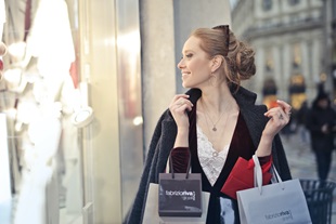
Our latest client in Fashion eCommerce, we delivered Cope Active a stylish and pixel perfect Magento website to showcase their range of women’s active wear.
Creative Director Leo Alfieri gave his views on the designs
“Cope’s product and photography style was to showcase vibrant, rich colours on beautiful models and we needed to create a platform that would allow the products to be the hero of the website. Using a sleek and minimalist black, white and grey colour palette we allow the photography to shine through, whilst innovative features like the advanced zoom showcase small details in the product, adding to that effect of luxury”
We Love: It’s simple, we love everything about this site. We’re looking forward to enhancing this Magento eCommerce website over the coming months.
No. 4
Marc Jacobs offer a unique shopping experience, opting for a less formal approach to online shopping. On the surface, it looks like a clean and clear shopping experience, but with the additions of Javascript and CSS, the content really come to life – making it stand out.
We Love: The mobile / desktop user experience, with the clean white lines, full-screen menu and responsive imagery and videos.
No. 3
The Victoria Beckham website, is simplistic but elegant. So simple on the surface, but well thought out in the layout and design. It is indeed the clever user experience that starts the online shopping (or window shopping) journey that makes this website stand out from the rest. Immediately on entering the site, the user is shown catwalk videos and offered just 2 options – Shop or Look. The users are then offered a totally different experience depending on their reasons for visiting the website
The shop pages are equally elegant, but unobtrusive. They offer a clean, product focused conversion point, with the product dominating the centre of the page with ample white space to let the eye get drawn into the image.
We Love: The less is more approach that the Victoria Beckham website has adopted. If it doesn’t need to be there, is isn’t – how many online stores can offer that?
No. 2
For a brand voted best department store in the Global Department Store Summits 2010, 2012, 2014 you expect a beautiful department store, but the way Selfridges.com instantly translates that same feel online is genius.
We Love: The simplistic use of the iconic Selfridges Yellow. It draws the eye to the important areas on the page. We also love the full page product zoom feature which brings the user close to the product.
No. 1
For all things luxury fashion, Net a Porter still remains our hot favourite. Their simplistic monochrome design provides the perfect platform for the products to look their best.
We Love: Many things about this website, the Edit (online magazine) features regular fresh lifestyle content. The product pages are slick, with smart accordions to minimize the content shown on the page, whilst the imagery and online video are standardised to give a seamless shopping experience.
The coolest feature has got to be on the homepage, a subtle hint to showcase the number of online shoppers currently on the site. It’s a subtle nudge, encouraging users that there are prying eyes on the products, and if you want it – you better order soon before stocks run out. Creative genius.
Want help with your next fashion eCommerce website design?
Maybe you’re looking for a new fashion website for your luxury brand, or need an innovative eCommerce website that really oozes luxury, quality and finesse. Why not talk to us about what we can do for your business and how we can make your website sell.
Appnova is a London digital agency specialising in web design, UX, e-commerce, branding, digital marketing and social media. Keep following us on Twitter @appnova and “like” us on Facebook for useful news and tasteful digressions about geeky stuff.


![10 latest trends in digital marketing for beauty brands [Part.2]](/-/media/Appnova/Blog/ScreenShot20151026at1500471940x567/10-latest-trends-in-digital-marketing-for-beauty-brands-Part-2.jpg?mw=310)
![10 latest trends in beauty web design and digital marketing [Part.1]](/-/media/Appnova/BannerImages/18376519151_bbeaa6dafc_b-1/trends-in-beauty-web-design-and-digital-marketing/10-latest-trends-in-beauty-web-design-and-digital-marketing-Part1.jpg?mw=310)


)
)
0.Comments