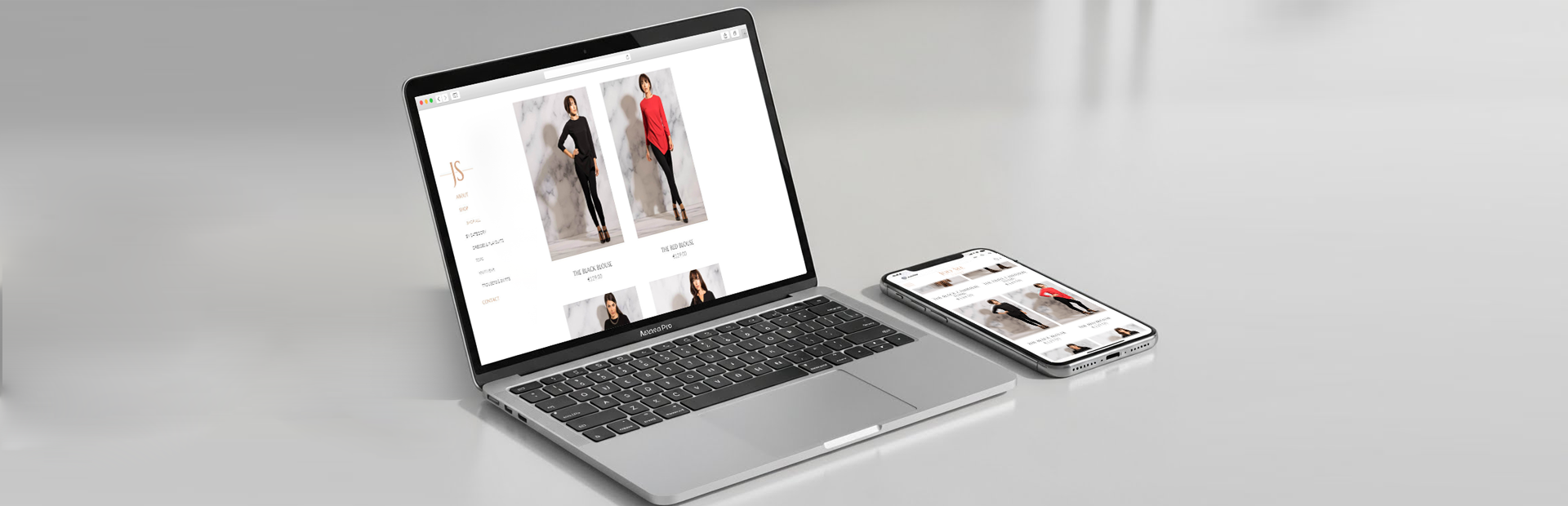
Subtle and powerful. Typography has both elements.
Most of us overlook the effect of typography on our perception, but it is something that actually makes designers go crazy.
Why? Because any subtle change in it can make a powerful impact.
‘Web design is 95% typography’, according to the people at iA.
Some disagree with them, but undoubtedly their point is quite strong. Typography is just as important as visuals, colours and other design factors. Choosing the right typography for your website is not that different from choosing the brand identity.
So how can a website use typography to improve UX?
Typography and UX design
- Visual hierarchy
You don’t want to make your website look like a dark cave that paralyses people’s sense of direction, as illustrated by Copyblogger. A visual hierarchy kindly leads visitors around the page. And typography is indispensable for a good visual hierarchy.
You don’t want typography that distracts visitors, right? You want your text to be read in an order. Priorities should be highlighted in big fonts or so.
A good book guides readers from a title, headings and to chapters.
It comes as no surprise.
- Aesthetics & legibility
Generally it has two purposes – artistic beauty and functionality. It’s not just font size or type. Typographic design includes consistency, alignment, spacing and much more. All elements guide visitors to important content.
It has to be artistic AND make sense (see webdesignerdepot).
- A personal connection
We, human beings, subconsciously look for connections.
Beautiful typographic designs tell people a story. When choosing a right typeface, you are creating the vibes of your brand at the same time.
It doesn’t change linguistic meaning. Orange is the same as orange or orange. Apart from Comic Sans, of course, just do not use it!
But each gives different personalities in the digital world. It plays a role of ‘vocal tone and body language’, to add some human side (Smashing Magazine).
More than just words
Good typography doesn’t normally get noticed because it’s something natural. You just want to keep reading them (see Webinsation, Creativemarket).
Remember the inspirational speech by Steve Jobs at Stanford?
‘’I decided to take a calligraphy class to learn how to [learn calligraphy]. I learned about serif and sans-serif typefaces, about varying the space between different letter combinations, about what makes great typography great. It was beautiful. Historical. Artistically subtle in a way that science can’t capture. And I found it fascinating. None of this had any hope of any practical application in my life. But 10 years later, when we were designing the first Macintosh computer, it all came back to me. And we designed it all into the Mac. It was the first computer with beautiful typography […]’’
Long story short, typography matters.
What do you think?
London Web Agency Appnova – keep following us on Twitter @appnova and “like” us on Facebook for useful news and tasteful digressions about geeky stuff.
(Quote taken from Tutsplus)


0.Comments