How to Create Seamless User Journeys Across Web and Mobile
Most people jump between devices without even noticing it. They might start browsing on a laptop at work, check something again on their phone later, then finish the task on a tablet at home. The expectation is that every step should feel familiar and fluid. No odd layout changes. No missing features. No friction.
Have you ever tried to complete something on mobile and thought, “Why does this feel completely different to the website?” That disconnect is exactly where brands lose people. Drop-offs rise, trust dips, and the overall experience feels fragmented rather than thoughtful.
The real question is this: how do you create journeys that feel connected across every screen? What does it take to give users that sense of continuity, even as they move between devices at different moments in their day?
That’s what this piece explores. You’ll find practical UX principles, design considerations and technical approaches that help you build a genuinely joined-up digital experience. The goal is to make each step feel intuitive, predictable and reassuring wherever the user picks things up again.
So, let’s take a look at how to create seamless user journeys in more detail.
Understanding the Concept of a “Seamless User Journey”
When people talk about a seamless digital customer journey, they’re really talking about one simple idea: the experience should feel the same wherever the user is. No surprises, no odd jumps, no moment where they have to stop and think, “Hang on, where did that option go?”
Have you ever switched from a laptop to your phone and felt like you’d landed on a completely different version of the same brand? That’s the exact moment where users drift away. A seamless journey avoids that by keeping everything connected.
Ultimately, it comes down to a few things working together:
Consistent design
Colours, spacing, imagery and overall style should feel familiar across every screen
Aligned functionality
The key actions should always be available, even if the layout changes
Clear messaging
The tone should stay steady, so the brand feels like the same voice everywhere
A simple everyday example? Someone browses on desktop, adds something to their basket, heads out, and later completes the purchase on their phone without having to restart. That’s the kind of continuity users now expect as standard.
You see this handled well by brands known for thoughtful digital experiences. Their interfaces feel steady whether you’re on mobile or desktop, and the handover between devices doesn’t draw attention to itself. It just works. And when it works, users barely notice, which is exactly the point.
Why Consistency Across Web and Mobile Is Essential
A unified experience across devices does more than “look nice”. It shapes how users feel, how easily they move through tasks and whether they trust the brand behind the interface. When the journey breaks between screens, people feel it immediately.
User expectations have evolved
Most online activity now happens on mobile, but users still expect the sharpness, speed and stability they’re used to on desktop. If one version feels weaker, people read that as a lack of investment.
You see the impact across:
- Trust – Users stay calmer and more confident when everything behaves the way they expect
- Momentum – Fewer bumps in the journey mean people keep moving
- Reduced frustration – Small inconsistencies add friction, and friction pushes people away
Have you ever tried completing a quick task on your phone only to give up because something didn’t load properly or wasn’t where you thought it would be? That’s the experience you’re working to avoid.
Omnichannel behaviour is the norm
People rarely complete a full journey on one device. They jump around throughout the day. A bit of reading on desktop during a break, another check on mobile later, then the actual action when they have a moment.
A joined-up approach helps because it offers:
- Continued flow – No repeating steps or hunting for lost features
- A familiar environment – Even small visual consistencies help users feel grounded
- Stronger conversion potential – When the path feels smooth, people are more likely to finish what they started
- Less cognitive load – Switching devices shouldn’t feel like starting again
The easier you make the handover, the longer people stay with you.
Brand perception and credibility
This is where consistency becomes a brand signal as much as a UX one. When everything looks steady and intentional, users feel the quality behind it. When it doesn’t, the brand appears scattered.
A consistent experience contributes to:
- Recognition – Users instantly know they’re in the right place
- Professionalism – A cohesive approach suggests a well-run, well-designed digital ecosystem
- User confidence – People trust brands that feel stable across every touchpoint
- A stronger identity – Visual and tonal alignment reinforces what the brand stands for
A smooth cross-device experience isn’t just functional. It quietly shapes the way users think about the brand as a whole.
Key Principles for Designing Seamless Web and Mobile Experiences
Designing for multiple devices is rarely a clean, linear process. It’s more like trying to make sure every part of a journey feels connected, even though the user might cut across different routes. One moment they’re on mobile queuing for lunch, the next, they’re back at a large desktop screen at home. They shouldn’t feel disoriented at any point.
If you’ve ever switched devices mid-task and found yourself thinking “Where did everything go?”, you already know why these principles matter. Let’s break them down in a way that mirrors how people actually move through digital experiences today, not how we wish they would.
Maintain Visual and Brand Consistency
Users rely heavily on visual cues. They don’t sit and analyse typography or colour choices, but they do immediately sense when something feels unfamiliar. That tiny hesitation can derail a journey faster than most people think.
Before diving into rules, think about this question. If someone picked up your mobile site with no context, would they instantly know it belongs to the same brand as your desktop experience? If there’s even a pause before you answer, there’s work to do.
What helps create that familiarity
- Consistent colour choices – A steady palette supports instant recognition
- Clear type hierarchy – Text should guide the eye in the same way across devices
- Aligned iconography – Icons shouldn’t shift shape or meaning between screens
- Unified imagery – Photography or illustrations should evoke the same atmosphere everywhere
A familiar visual language reduces the amount of thinking a user needs to do. That’s often the difference between a smooth journey and an irritated bounce.
The emotional side
Visual consistency also carries emotion. The mood someone feels on desktop should carry over to mobile. Calm, bold, playful, luxurious, minimal… whatever the intention, it needs to travel across devices with them. People don’t consciously articulate this, but they feel it.
Ensure Functional Parity Without Carbon-Copying Layouts
This principle is misunderstood more than any other. Functional parity doesn’t mean cloning your desktop layout and shrinking it to fit a mobile screen. It means offering the same capabilities, delivered through layouts that make sense for each device.
Ask yourself a simple question. If a user prefers to complete a task on mobile, are you giving them the chance to do so without limitations?
Where parity truly matters
Core user actions – Searching, browsing, saving, buying, managing, signing in
Tasks that take place over time – Bookmarks, wishlists, saved states
If a feature is essential to the journey, it should exist everywhere. Layouts can change, but functionality shouldn’t vanish.
Why the layout shouldn’t match
Mobile design has its own rhythm. Users scroll more. They tap instead of clicking. They rely on thumb-friendly spacing. Trying to squeeze desktop behaviour onto a phone usually creates friction.
A mobile-first mindset can help here. It forces clarity. When you start small, you naturally prioritise what users genuinely need. Everything else becomes optional rather than clutter.
Optimise Navigation Flows
Navigation is one of the easiest ways to lose users without even realising it. If someone can’t find what they need quickly, they’ll leave. Mobile makes this even more visible because space is so limited.
Think about your own browsing habits. How long do you spend searching for a hidden menu item before giving up? Probably not long.
Practical ways to keep users on track
- Clean menus – Collapse what you can, highlight what people use most
- Helpful breadcrumb trails – Especially important on content-heavy sites
- Persistent calls-to-action – Keep the key actions within reach
- Reliable search – Many users head straight for search on mobile
Navigation should feel like a guiding hand, not a puzzle. Users want a sense of orientation at all times, no matter which screen they’re holding.
Create Continuity in User Actions
This is where the cross-device experience either comes together beautifully or falls apart completely. It’s not enough for screens to look similar. Users want their actions to follow them.
What continuity actually looks like
- Carts staying full – If something was added on desktop, it should still be there on mobile
- Partially completed forms – No one enjoys typing the same information twice
- Remembered filters – Users shouldn’t have to rebuild their journey every time
You probably recognise the irritation when something you saved simply disappears because you switched devices. That frustration is avoidable with the right behind-the-scenes decisions.
How the technical side supports the experience
A mix of cookies, session data and logged-in accounts usually sits behind this continuity. None of it is glamorous, but it makes the journey feel effortless. Users shouldn’t need to know how it works, only that it does.
Prioritise Speed and Performance
Speed isn’t really optional anymore. We’re all impatient. If a page drags its feet, people assume something is broken or unreliable, especially on mobile, where attention is already stretched.
Ways to keep things running smoothly
- Lazy loading – Load elements as they’re needed, not all at once
- Image optimisation – Deliver lighter files to smaller screens
- Caching techniques – Reduce repeat loading times
- Clean code – Remove scripts that create drag for no reason
These choices shape whether your experience feels modern or outdated. Users don’t talk about caching strategies, but they absolutely feel the difference.
Why speed equals trust
Slow interfaces feel unstable. Fast ones feel professional. It’s that simple. People equate performance with competence.
Accessibility and Inclusivity
User journey optimisation means the journey should be seamless for everyone. Accessibility isn’t about ticking boxes. It’s about giving every person the chance to complete tasks without frustration, regardless of ability, device or environment.
If someone can’t read text on a bright day, tap a button easily or navigate with assistive tools, the journey has already broken.
What makes an experience more inclusive
- High-enough contrast – Text should stay readable in all conditions
- Comfortable touch targets – Fingers need space, especially on mobile
- Proper ARIA labels – Screen readers rely on accurate descriptions
- Logical heading structures – Helps both assistive tech and scanning readers
- Keyboard-friendly navigation – Essential for many desktop users
These improvements help everyone. Clear structure benefits people with no accessibility needs at all. Good accessibility often overlaps with good UX, because clarity is universal.
Bridging the Gap Between Web and Mobile: Technical and Design Strategies
If you want the journey to feel smooth across devices, it’s not enough to rely on good design instincts. The technical foundation matters just as much. Even the most polished interface will fall apart if the underlying structure doesn’t support consistent behaviour.
This section goes deeper into the practical tactics that help teams deliver experiences that work reliably, whether someone is on a small phone screen or a full desktop setup. Think of these strategies as the connective tissue behind everything users interact with.
Responsive Web Design
Responsive design is still the backbone of any multi-device experience, but the expectations around it have evolved. It used to be considered a “bonus”. Now it’s non-negotiable.
A responsive layout isn’t simply about shrinking content. It’s about making choices that respect the strengths and limitations of each device.
What strong responsive design includes
- Adaptive grids – Layouts that flex rather than break as screens change
- Fluid elements – Images and containers that scale smoothly instead of snapping
- Thoughtful breakpoints – Not just desktop and mobile, but the in-between states users actually use
- Readable text – Typography that adjusts to size, spacing and readability needs
A user should never wonder why a component suddenly looks misaligned or why a button disappears on a smaller screen. When the foundation is well set up, the shift between breakpoints feels natural, not forced.
Why this is still essential
Responsive design lets you maintain a single codebase while still creating tailored experiences. More importantly, it keeps future devices in mind. Screens will continue to change. A flexible system adapts with them.
Progressive Web Apps
PWAs give users something that feels close to a native app without forcing them to download anything. They bridge a significant usability gap for businesses that don’t want to build and maintain a full app but still want to offer an elevated mobile experience.
Ask yourself this: would your users benefit from something faster, more reliable and capable of offline use? If the answer is yes, a PWA is worth considering.
What PWAs bring to the table
- App-like speed – Faster loading and smoother transitions
- Offline capability – Users can stay active even with spotty connections
- No installation barrier – Access through the browser with an option to “add to home screen”
- Consistent experience – Whether on mobile or desktop, the behaviour remains stable
Many well-known platforms adopted PWAs because they saw a significant uplift in engagement. The takeaway isn’t about naming those examples but about recognising why the shift worked. People enjoy experiences that feel lightweight but still powerful.
When PWAs make the most sense
They’re particularly useful for brands with high mobile traffic, large product catalogues or audiences who browse in environments where connectivity might fluctuate. If mobile users often abandon tasks due to lag or long loading times, a PWA can be a game-changer.
Unified Design Systems
If you’re aiming for a seamless multi-device journey, a design system isn’t optional. It’s the central source of truth that keeps every team working in alignment. When design, development and content all pull from the same system, the final product becomes far more consistent.
What a design system should offer
- Reusable components – Buttons, forms, cards and patterns that behave consistently everywhere
- Clear documentation – Naming conventions, interaction rules, spacing systems and tone guidelines
- Shared libraries – Easy access to pre-approved elements for different teams
When a team uses scattered components across projects, inconsistencies creep in. A well-maintained design system prevents this. It also accelerates the workflow, because you’re not reinventing the same element every time.
Why this matters for cross-device UX
Without a shared system, your mobile and desktop experiences naturally drift apart. Designers improvise. Developers interpret. Messaging shifts subtly. These small variations add up. A unified design system acts like a stabiliser.
Cross-Platform Testing
Testing across multiple devices is often underestimated because teams assume responsive design “should work”. In reality, there’s no substitute for seeing your experience on real hardware.
Ask yourself how many times you’ve tested something on a large monitor only to realise it behaves very differently on a mid-range Android phone.
What to test beyond layout
- Touch interactions – Buttons need enough space, especially for thumb use
- Font scaling – Some devices enlarge text unpredictably
- Form behaviour – Keyboards, field focus, and error messages often act differently across browsers
- Orientation changes – Portrait and landscape can behave like two different environments
Browser emulators are helpful during early development, but they’re not enough. Real-device testing exposes issues you won’t catch otherwise, particularly around performance and interactive behaviour.
How this supports seamless journeys
If transitions between devices feel disjointed, it’s usually because the details weren’t tested thoroughly. Real-device testing reveals these gaps and helps refine the experience before users ever encounter them.
Integrated Analytics
If you want to understand where the cross-device journey actually breaks, you need analytics that track behaviour holistically rather than by device silo. This is where most teams uncover insights that shift their entire approach.
What analytics helps you understand
- Where users drop off – Especially when switching between devices
- Which screens feel slow or confusing – Often revealed through heatmaps or session replays
- How returning users behave – Do they continue where they left off or restart?
- What device paths are most common – Desktop to mobile? Mobile to tablet?
Platforms that combine quantitative and qualitative data give a fuller picture. Numbers show the symptoms, and recordings show the why.
Using insights effectively
The goal isn’t to drown in data. It’s to identify friction points and decide how to smooth them out. If analytics shows that users consistently abandon a task on mobile but complete it on desktop, you have a clear signal. If switching from mobile to desktop causes repeated reorientation, you can trace what element is missing or inconsistent.
Why this matters for continuity
A seamless journey shouldn’t be based on guesswork. Analytics connects the dots between devices and exposes where the experience fails to live up to user expectations.
Bringing These Strategies Together
When you combine responsive design, PWAs, design systems, rigorous testing and integrated analytics, you create a framework that supports a genuinely connected cross-device experience. None of these tactics operates in isolation. They interact, reinforce one another and create a level of stability that users feel immediately.
A seamless journey isn’t built through guesswork or surface-level design polish. It’s built through consistent structure, strong systems and a commitment to understanding what happens as users move from one screen to another.
Case Studies: Brands That Nailed Seamless Multi-Platform Experiences
You don’t need to copy these brands, but you can learn a lot from how they approach cross-device journeys. Each one takes a slightly different route, yet they all share the same foundation: clarity, consistency and a real understanding of what users expect when switching between screens.
Nike

Nike is a good example of how to keep a digital ecosystem feeling unified without making every platform look identical. The website and mobile app follow the same visual language and tone, so users don’t feel like they’re entering a new environment each time. Profiles, preferences and rewards move with the user. That continuity means people can browse on a desktop during a break, then pick up their progress instantly on mobile when they’re out.
What works well here is the mix of functional consistency and familiar design. Nothing feels out of place. Core features behave predictably, which reduces friction for returning users. That sense of stability is a major part of what keeps people engaged.
Airbnb
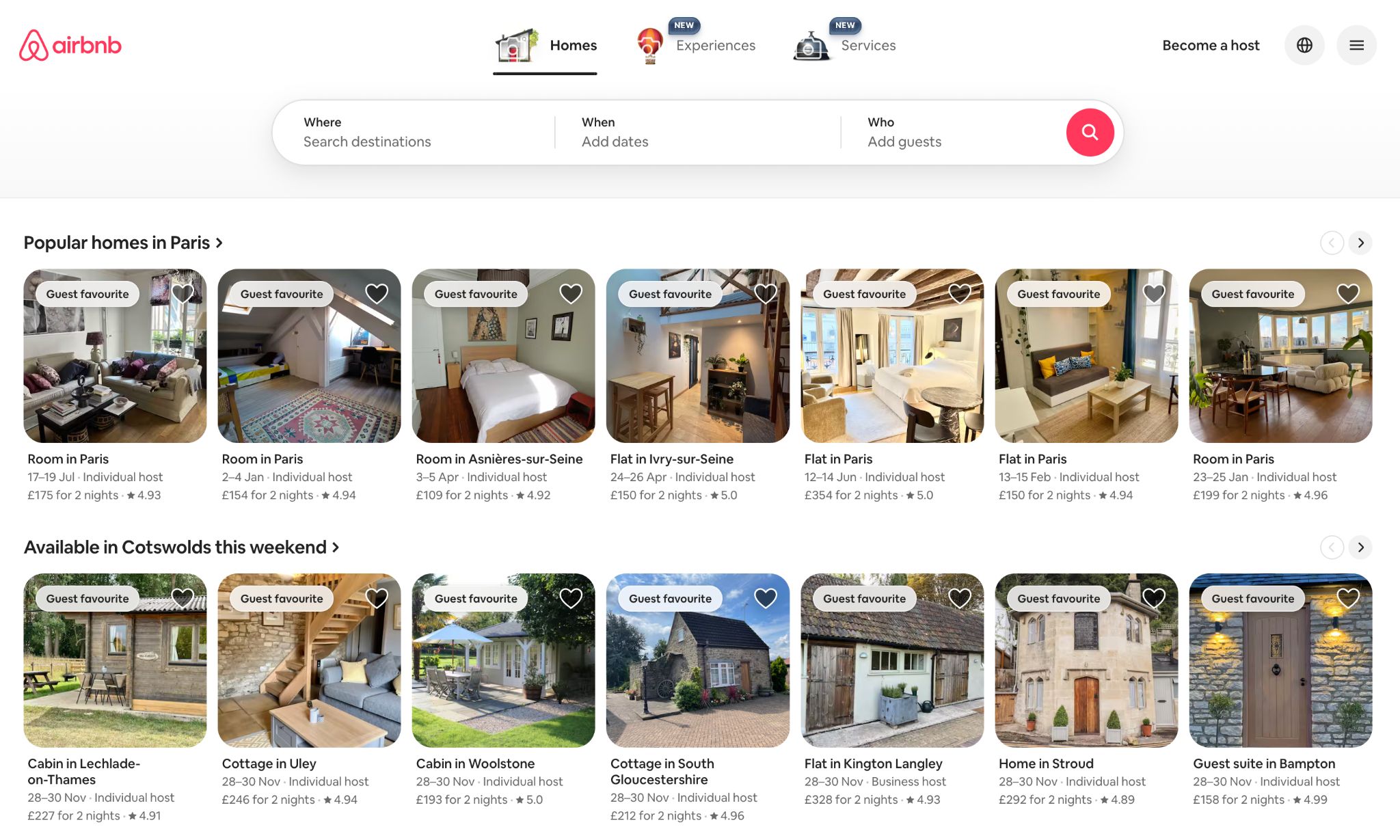
Airbnb handles cross-platform browsing remarkably well. The experience feels calm and structured, whether you’re scrolling on your phone or exploring listings on a laptop. Everything from filters to messaging behaves consistently across screens. If you start planning a trip on a desktop, the details carry over smoothly when you switch to your phone later.
The key strength here is the logic behind the user journey. Navigation is clear. Interactions feel intuitive. You never have to wonder where something is or why it looks different. Airbnb’s success comes from treating every device as a continuation of the same journey, not a separate version of it.
Amazon

Amazon is known for continuity. Cart items remain in place. Browsing history carries over. Recommendations update in real time. If you’ve ever added something on mobile and later completed the purchase on desktop without missing a beat, you’ve experienced this in action.
The real winning factor is how predictable everything feels. The design isn’t radically different between devices, but more importantly, the underlying data is synced. Users feel recognised wherever they log in. That level of consistency builds trust fast. It’s also a big reason people return repeatedly without hesitation.
Common Pitfalls to Avoid
Even well-intentioned teams slip into patterns that unintentionally break the cross-device experience. Most of these issues don’t show up as huge errors. They tend to creep in gradually until users start dropping off or behaving in ways you didn’t expect. Here are the traps that come up again and again, and why they matter.
Treating web and mobile like separate projects
It’s easy for teams to divide responsibilities, but when design and development happen in silos, the experience naturally drifts apart. Different decisions get made. Features behave one way on mobile and another on desktop. Messaging shifts tone. Before you know it, users feel like they’re interacting with two separate products.
A better approach is to define shared foundations early. Visual guidelines, component behaviours, tone choices and functional requirements should all come from the same source of truth. When everyone builds from the same core, the journey feels unified by default.
Navigation that changes too much between devices
Menus that jump around, CTAs that move location or disappear entirely and links that shift position can throw users off instantly. People rely heavily on muscle memory, especially when using their phone.
This doesn’t mean copying desktop layouts on mobile. It means thinking carefully about consistency in logic. Users should still understand where key actions live, even if the layout has adapted to fit a smaller screen.
Forgetting how demanding mobile performance can be
Mobile performance isn’t only about load speed. It’s about how stable the experience feels while someone is on the move or using an inconsistent connection. Unoptimised images, heavy scripts or oversized animations can create noticeable delays.
These delays often cause users to abandon a task without giving it a second chance. Keeping things lightweight on mobile isn’t about simplifying the design. It’s about respecting the reality of how and where people use their devices.
Overlooking device-specific behaviours
Every device has its own habits. Mobile users swipe, pinch and tap in ways desktop users don’t. Desktop users rely on precise cursor control. If your interface ignores these behaviours, the journey feels unnatural.
It helps to ask questions like:
Would this interaction feel intuitive if someone used one hand?
Does the spacing work for thumbs?
Does the content adapt well when viewed in portrait?
Answering these honestly usually exposes the adjustments that need to be made.
Not testing the actual flow between devices
Many teams test desktop flows. Many test mobile flows. Very few test the switch between them. That’s often where issues hide. A cart that doesn’t sync. A form that resets. A page that looks completely different when revisited on another screen. These bumps break the momentum of a journey that otherwise looks solid.
Testing transitions doesn’t need to be complex, but it is essential for seamless UX design. Walk through the same task on different devices and note where the experience feels disconnected. That simple step often reveals problems no spreadsheet or design file will show.
Tools and Frameworks for Creating Seamless Experiences
You don’t need a huge toolkit to create a smooth cross-device experience, but you do need the right mix. Most teams collect tools over time, and half of them sit untouched. What really matters is choosing platforms that help you design consistently, test ideas early and understand how people behave across different screens.
Below is a more grounded look at the tools that genuinely support those goals, without turning this into a rigid checklist.
Design tools that help things stay consistent
A lot of the heavy lifting happens before a single line of code is written. Designers rely on tools that keep layouts tidy, typography stable, and components reusable. The best ones also make it easier for teams to stay aligned:
- Figma is collaborative, centralised and great for building shared component libraries.
- Sketch is still valued in teams that prefer a plugin-heavy workflow.
- Adobe XD is often used when teams want to build quick interactive flows.
What really matters is how disciplined your team is about using these tools. A well-maintained design library usually makes a bigger difference than the platform itself.
Prototyping tools that expose problems early
It’s one thing to design a nice layout. It’s another to see how the journey feels when someone interacts with it. Prototypes uncover gaps you simply won’t notice in static mockups.
Some helpful options:
- InVision for simple, clickable journeys.
- Maze for structured testing with tasks and metrics.
- UserTesting when you want natural reactions rather than internal assumptions.
One tip: test on the actual device sizes users rely on the most. A prototype that feels perfect on desktop can fall apart completely on mobile.
Tools that keep performance under control
Performance shapes the user’s first impression more than the visuals. Most people won’t wait for a slow page, especially on mobile. That’s why teams lean on tools that highlight slow scripts, oversized images or layout shifts.
A few worth working into your process:
- PageSpeed Insights for quick wins.
- Lighthouse for deeper audits.
- WebPageTest if you want to see how your pages behave in more realistic conditions.
The key is regular checking rather than a single optimisation sprint at the end. Small fixes across the project often have the biggest impact.
Frameworks that help unify behaviour across devices
Different devices behave differently, but using the right framework can help you keep a consistent logic across platforms. This doesn’t mean identical layouts — just a more predictable foundation.
Here are a few approaches teams often consider:
- React Native when a mobile app needs to share logic with existing web projects.
- Flutter if you want an extremely consistent UI across platforms.
- Progressive Web Apps for teams that want app-like speed and offline access without committing to a full native build.
The choice depends heavily on your goals, the size of your team and how often you plan to update the experience.
Tools that reveal real user behaviour
Without analytics, it’s impossible to know where the cross-device journey breaks. Guessing rarely works. Instead, use tools that show how people actually move through your site, where they hesitate and where they abandon tasks.
A balanced mix usually works best:
- Google Analytics 4 for understanding overall paths between devices.
- Hotjar for heatmaps and recordings that highlight confusion points.
- Crazy Egg for scroll behaviour and click hotspots.
- FullStory when you want more detailed behavioural insights.
You don’t need all of them, but combining numbers with visual behaviour tends to reveal where the real issues sit.
A practical approach to building your toolkit
Start small. Pick tools that help you solve clear problems, not the ones that look impressive in a stack diagram. Seamless cross-device journeys come from teams who pay attention to the details, test often, and rely on data rather than assumptions. The right tools simply make that work easier, faster and far more reliable.
The Future of Cross-Platform UX in 2025 and Beyond
Cross-platform behaviour is changing fast. It’s no longer just about whether someone prefers a phone or a laptop. People move through different moments in their day and expect the experience to adjust without fuss. What’s coming next reflects that shift toward flexibility and context rather than device categories.
AI taking on a more adaptive role
AI is already everywhere, but the next step is far more subtle. Instead of throwing out generic recommendations, it starts shaping the journey around each user’s immediate situation. A flow might shorten itself automatically on mobile when the user is clearly in a hurry. A returning visitor may find the page already prepared with the options they usually look for. Even something as simple as reorganising content based on previous habits can make the experience feel lighter and more human. It’s less about clever tricks and more about removing unnecessary effort.
Voice and wearables becoming part of the main journey
The idea of “primary device” is fading. People check things on their watch while walking, use voice when their hands are full, and then finish the task later on a screen. These touchpoints work best as quick, purposeful moments: small actions that slot into someone’s day without interruption. The challenge for teams is making sure whatever happens on a watch or through voice doesn’t sit in its own bubble. It needs to feed back into the wider journey so the user never feels like they’ve stepped off the main path.
AR and VR used for clarity, not spectacle
Immersive tech is becoming more useful in practical ways. Users want a clearer sense of what they’re about to buy or book, and sometimes a flat screen just doesn’t provide enough context. AR and VR help fill that gap. Seeing an item in your own space, previewing a location before committing, or exploring variations in a more realistic setting all help people make decisions with more confidence. When this works well, it feels like a natural add-on rather than a separate “experience” altogether.
Predictive UX quietly smoothing the journey
Predictive UX is moving from experimentation to everyday use. Instead of waiting for the user to make every small decision, the system handles some of the legwork. Common actions surface earlier. Repetitive steps shrink. Options that are usually ignored fade into the background. Done well, it doesn’t feel like the interface is trying to be clever. It just makes the journey feel calmer and more straightforward, especially for returning users.
FAQs
What’s the biggest challenge in creating seamless cross-platform experiences?
The hardest part is keeping everything aligned when users can enter the journey from any device at any moment. Most teams design in neat phases, but real behaviour isn’t neat at all. Someone might start on a tablet, continue on mobile, then finish on a desktop days later. The challenge is making sure the journey feels like one continuous space rather than three separate products stitched together.
How does mobile-first design help in cross-platform UX?
Mobile-first design forces clarity. You strip the experience down to the essentials, decide what truly matters and build upwards from there. That usually leads to cleaner layouts, simpler flows and content that holds up better across different breakpoints. When the mobile version works smoothly, the rest tends to follow naturally.
Do I need a mobile app if my website is responsive?
Not always. A responsive site can easily cover most use cases. A dedicated app only becomes useful when you need deeper functionality, offline access, richer interactions or features that rely on native device capabilities. If your users just want quick browsing, easy purchases or simple account management, a well-built responsive site or a PWA often does the job.
What KPIs help measure whether the journey is truly seamless?
There’s no single metric that tells the full story, so it’s worth looking at a mix. Think about cross-device return rates, task completion rates, time to complete common actions, drop-offs during device switching and the number of users who successfully resume their journeys. Session replays and heatmaps can also reveal friction points you won’t spot in raw numbers.
How does AI improve the cross-platform experience?
AI helps by making the experience feel more adaptive. It can recognise repeated patterns, identify where someone left off and surface the most relevant content for the moment. AI also supports smoother transitions, for example, automatically restoring a half-finished task on another device or reshaping layouts based on the user’s context. When done well, it reduces the amount of thinking the user needs to do.
Bringing Everything Together
Cross-platform journeys succeed when they feel stable, predictable and connected, no matter where the user starts or finishes. A joined-up experience encourages trust, increases retention and strengthens the relationship between the user and the brand behind the screens. Web and mobile shouldn’t sit apart. They’re both parts of the same ecosystem, each supporting the other.
If you’re unsure where the gaps are in your own experience, start with a simple audit of how the journey behaves across devices. Follow the same task on multiple screens and see where things feel clunky or disconnected. And if you want expert support shaping something more cohesive, the Appnova team can help you craft digital journeys that feel natural from start to finish.


Subscribe To Us
Contributors
Categories

0.Comments