How to Build a Winning UX Strategy for Digital Success?
Let’s start this week’s blog with a question, and I want you to be honest with yourself… How many people clicked on your ad, landed on your site, and then disappeared this week?
They didn’t buy…
They didn’t even browse for long…
One second they were there, the next they were gone.
Chances are, it had nothing to do with your product. It was the experience.
We’ve all been that person, haven’t we? You visit a site and it feels clunky. Pages drag as they load, the menu feels like a maze, and by the time you reach the checkout, it’s asking for everything short of your blood type. You leave. You don’t come back. And if that’s happening on your site, you’re not just losing clicks, you’re losing sales, day after day.
In fact, studies show that 88% of users won’t return after a poor experience. Meanwhile, according to Forrester, companies that invest in user experience can see a return of up to 100 times their investment.
It’s quite simple: the way your site or app feels directly impacts your bottom line.
That’s where UX strategy comes in. Not just making things look slick, but building an experience that feels effortless, natural, and, importantly, converts. A good user experience strategy maps every click, every scroll, every path, so your users find what they need without friction, while your business quietly achieves its goals in the background.
What Is a UX Strategy?
A lot of people think UX strategy is just “making the website look nice.” Fonts, colours, maybe a cleaner menu. However, that’s like thinking a house is well-built because it has a fresh coat of paint. You can make something look stunning, but if the foundations are shaky, people won’t stick around.
A proper UX strategy is the blueprint beneath the visuals. It’s how you decide what your users actually need, how they’ll move through your site or app, what problems you’re solving for them, and how every interaction also supports your business goals. When you get it right, the experience feels seamless. Users find what they’re looking for, feel confident about their decisions, and convert without hesitation.
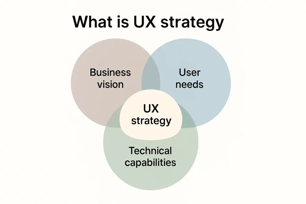
Think about it this way: without strategy, your design is guesswork. You might attract traffic, but people will drop off at checkout or abandon your app entirely because the experience doesn’t make sense for them. The brands that thrive are developing a UX research strategy, as well as making the most of data and testing to guide how their sites and apps actually work for real humans.
A solid UX strategy pulls together four things:
- Real insight into how users behave, not assumptions.
- A clear understanding of what the business needs to achieve.
- A mapped-out digital journey that connects the two.
- A way to measure and refine everything over time.
Get those working together and you’ve got a site or product that feels easy for users and delivers results for your brand. Miss one and you’ll feel it in terms of lower engagement, higher drop-offs, and frustrated customers who won’t be back.
Why Is User Experience Design Strategy Important?
You can have the best product in the world, pour thousands into ads, and still watch people leave your site without buying. It’s infuriating, isn’t it? Most of the time, it’s not because your offer is bad. It’s because the experience gets in the way. Slow loading pages… Menus that feel like a puzzle… Checkouts that ask for everything short of a DNA sample… People don’t complain. They just vanish.
And here’s the part that stings: most of them won’t ever give you another chance. Almost nine out of ten people won’t return after a bad online experience. That’s not a small leak in your funnel, that’s a gaping hole! The flipside? Fix the experience and it can transform your bottom line!
Here’s what I tell clients: you can’t keep buying your way to growth if your experience is broken. You’ll just be pouring traffic into a leaky bucket. UI & UX design services are how you fix the leaks. It’s how you make sure every step, from the first click to the final checkout, feels natural, quick, and trustworthy. And when it does? People don’t just buy. They come back. They tell their friends. And suddenly, growth isn’t about throwing money at ads, it’s baked into how your brand works online.
Main Components of a UX Strategy
“UX strategy” sounds complicated, but it’s really just the plan to make sure your site actually works for the people using it, and does its job for your business. Here’s what that really means in practice.
Start by Actually Watching Your Users
When was the last time you sat and just watched someone use your site? Not your team… Not a designer…A real customer.
It may be a bit painful, but it’ll definitely be eye-opening. You’ll see the hesitation when they’re not sure where to click. The frustration when they can’t find something as basic as delivery info.
We’ve worked with brands convinced their outdated homepage was the big issue, only to realise people were bailing because the product filters were ineffective. Nine times out of ten, it’s not the thing you expect!
Make Sure It Works for You Too
Yes, customers want a smooth, easy experience. But this isn’t charity. Your site needs to deliver for your business. That means more sales, more email sign-ups, and more repeat purchases.
The trick is lining those things up. If your customers want to check out quickly, but you force them through a long account creation just to get their email, they’re gone. An effective UX strategy balances both sides, giving people what they need while quietly hitting your goals in the background.
Think Beyond “Homepage to Checkout”
Most brands map the journey like it’s a straight line: homepage → product → checkout. Real life isn’t like that.
People meet your brand through ads, Instagram, emails, or even word of mouth. They might browse, leave, come back days later, get a discount code, finally buy, track their package, maybe even start a return. All of those steps matter. If even one feels awkward, it can undo the good impression from the others.
Clarity Builds Trust
A site can be beautiful and still feel wrong if people can’t find what they need or it feels unreliable. Menus that are too busy… Product details that don’t answer basic questions… Pages that take forever to load…
Little things like hover states, progress bars at checkout, and clear calls to action make a difference. They reassure people that the site is solid, so they’re more likely to stick around and complete their order.
Keep It Alive
Here’s the thing: UX isn’t a one-off project. There’s no “done.” People’s habits change and competitors keep raising the bar. What feels fast and simple today could feel clunky a year from now.
The brands that win? They’re the ones that keep testing and tweaking. They treat their UX like something living, not a box to tick during a redesign.
Step-by-Step Guide to Create a Powerful UX Design Strategy
If your site is getting plenty of visitors but not enough sales, you don’t fix that with a shiny redesign. You fix it by understanding where things are going wrong and building a plan to solve those problems in a way that actually improves results. Here’s how to approach it.
Step 1. Be Clear on What You’re Trying to Fix
It’s surprising how many teams skip this. They jump straight into layouts and branding without agreeing on the problem they’re solving.
Is your priority…
Getting more people through checkout?
Increasing average order value?
Encouraging first-time buyers to come back?
Reducing drop-offs on mobile?
Each one needs a different approach. If you try to “fix everything” at once, you’ll spread resources thin and end up with surface-level tweaks that don’t make a real difference.
Step 2. Watch Real People Use Your Site (Without Interrupting)
One of the most eye-opening things you can do is simply observe people trying to complete tasks on your site. Don’t guide them, don’t explain, just watch.
Pay attention to things like:
- Where they hesitate or get confused navigating menus or categories.
- Whether they miss important actions like “Add to Cart” or filtering options, which could mean the design isn’t intuitive.
- Their reactions during forms or checkout. Are they visibly frustrated or sighing?
- How far they have to scroll to find essentials like delivery, sizing, or returns. If it’s buried, many won’t stick around to ask.
- If they switch to another device (grabbing their phone to compare competitors or speed things up), which often signals your flow feels clunky or slow.
Even a handful of test users can expose the areas that need urgent attention.
Step 3. Dig Into the Data to Find the Hotspots
Observations tell you what’s happening, but data shows you where to focus first. Look beyond page views and vanity metrics, and focus on:
- Pages with the highest exit rates — Is it happening on product pages, or are people leaving during checkout?
- Specific drop-off points in the funnel — How many add to cart but never reach payment? Where exactly do they give up?
- Mobile vs. desktop performance — If mobile drives high traffic but converts poorly, speed, layout, or touch interaction issues might be costing you.
- Time on supporting pages — Do people spend ages in FAQs or sizing guides? That usually means the key product or checkout pages aren’t giving them enough information.
- Repeat visits without conversion — Are users returning multiple times but not buying? Often this signals uncertainty over delivery, pricing, or trust.
Prioritising fixes based on these hotspots will have a bigger impact than spreading your effort evenly across the entire site.
Step 4. Map the Real Customer Journey
Forget the neat “homepage → product page → checkout” flow most teams imagine. Actual customer journeys are rarely linear.
Someone might see your Instagram ad, click through to a blog, browse a product, leave, come back via email, finally buy, then track their order and maybe start a return. Each one of those steps shapes their opinion of your brand.
Mapping the full journey, including post-purchase interactions like order tracking and support, shows where friction really lives. It’s often in places brands overlook because they’re focused only on pre-sale pages.
Step 5. Tackle the Biggest Frustrations First
Not every issue needs immediate attention. Focus on the problems that are actively costing you sales. Look for things like:
- Checkouts that feel endless, with unnecessary steps or account creation requirements.
- Pages that load slowly, especially on mobile.
- Delivery details hidden until the final stage, which often causes people to abandon carts.
- Broken or awkward site features, like product filters that don’t work smoothly.
Fixing these pain points often delivers faster, measurable results than aesthetic updates.
Step 6. Prioritise Flow Over Flash
Strong design isn’t about fancy visuals; it’s about making the experience feel predictable and trustworthy.
Consider:
Does your navigation remain consistent across devices?
Do users always know where they are in a process (like during multi-step checkout)?
Are calls to action clear and uniform, so people know what to click without hesitation?
Are there subtle touches, like hover effects or progress indicators, that reassure users things are working?
These details rarely stand out when they’re present, but their absence makes a site feel unreliable or unfinished.
Step 7. Test Before You Launch Changes
Testing saves time, money, and a lot of headaches.
Use clickable prototypes to trial updates with real people before development starts. Watch where they stumble, what they skip, and where they look uncertain.
Catching these issues early means you’re not paying to rebuild something after it’s already live.
Step 8. Treat UX as Ongoing, Not a Project
User expectations shift quickly, and competitors are constantly raising the bar. If you only revisit your UX every few years during a big redesign, you’ll fall behind.
The most successful brands treat UX like maintenance; monitoring behaviour, testing regularly, and making smaller improvements continuously so the experience never feels outdated or frustrating.
Most-Effective UX Strategies for Online Success
Here are the strategies I’ve seen make the biggest impact for brands looking to boost engagement, sales, and loyalty online.
Prioritise Mobile Like Your Revenue Depends on It (Because It Does)
Over 60% of web traffic now comes from mobile. Yet, too many sites still treat mobile as a “scaled-down” version of desktop. That’s a mistake. Mobile-first design isn’t just about responsive layouts. It’s about thinking small-screen first: fast load times, navigation you can use with your thumb, content that works on the go.
I tell clients this all the time: if your experience works beautifully on a phone, it will work anywhere. If it struggles there, you’re bleeding potential sales.
Personalisation People Actually Like
We’ve all had the creepy version of personalisation: when a brand knows too much and makes it obvious. But when done thoughtfully, personalisation can lift conversion rates by 10–20%, as per McKinsey.
A few ways brands make it work without crossing the line:
- Recommending products based on what someone browsed, not just what they bought.
- Showing relevant homepage content when a returning user lands.
- Offering shortcuts for frequently repeated actions (like reordering).
- Sending helpful reminders for abandoned carts, without overdoing it.
- Highlighting location-specific offers in a way that feels natural, not intrusive.
The trick? Make it useful, not invasive. Personalisation should feel like good service, not surveillance.
Make Checkout Feel Effortless
For e-commerce brands, checkout is where money is won or lost. Even small frustrations, such as a forced account creation, hidden delivery fees, or too many fields to fill, can tank conversions.
Quick wins that tend to work:
- Let people check out as a guest.
- Strip your forms down to essentials.
- Support one-tap payments like Apple Pay or Google Pay.
- Be upfront about delivery costs early on.
These tweaks might sound small, but I’ve seen brands cut cart abandonment by double digits just by fixing checkout friction.
Treat Speed as a Feature, Not an Afterthought
Page speed is one of the quickest ways to lose or keep a customer. Here’s the reality:
A site loading in under two seconds keeps users engaged.
At three seconds, conversions start dropping, by roughly 7% for every extra second.
At five seconds or more, over 40% of visitors will abandon the site entirely.
Optimising images, reducing unnecessary scripts, and designing for performance are vital to user experience.
Build Trust Through Small Interactions
It’s not just the big design elements that count. Subtle touches like hover states, progress indicators during checkout, or micro-animations when you add something to a cart help users feel confident the system is working.
These details are often invisible when they’re there, but glaringly obvious when they’re not.
Accessibility Isn’t Optional Anymore
Roughly 1.3 billion people globally live with some form of disability. Designing with accessibility in mind doesn’t just widen your audience, it improves the experience for everyone. Clear contrast, logical navigation, and screen reader support make your site usable and compliant, and show that your brand actually cares.
Keep Improving, Always
The most successful brands treat UX as something living, not something you “finish.” They use A/B testing, heatmaps, and analytics to watch how people really behave, then make evidence-based changes. The result? A digital experience that gets better, month after month, while competitors stagnate.
Real-World UX Strategy Examples
Amy Henley
Amy Henley, a London-born footwear and accessories designer, needed more than just an online shop. The brand wanted a digital flagship store that reflected its ethos of sustainability, Italian craftsmanship, and timeless style while making it easy for fashion-conscious customers to explore and buy its collections.

Appnova built a sleek Shopify store designed to feel as elegant as the products themselves. The UX strategy focused on a clean, minimalist layout that showcased each handcrafted piece with rich imagery, clear product storytelling, and intuitive navigation. Every detail, from product filtering to the checkout flow, was designed to keep the experience effortless while highlighting the brand’s luxury positioning.
The result was a distinctive e-commerce site that feels polished and timeless, with a graceful, contemporary edge that draws users in and keeps them engaged. The user experience not only captured Amy Henley’s brand values but turned them into a functional, conversion-focused digital journey.
Doji
Launched in January 2024, Doji lets users create accurate AI avatars from selfies and full-body images, enabling them to virtually try on designer clothes before purchasing. Its interface guides users through a simple photo upload flow, then presents outfit combinations in a clean, immersive gallery.

Early beta users praised the realism and intuitive layout. According to Business Insider, the app is so compelling that Reddit co-founder Alexis Ohanian invested early on, noting, “consumer is fun again thanks to AI.”
What makes this UX product strategy shine in 2025 is how it transforms uncertainty (around fit and style) into confidence, letting users explore looks without friction, and seamlessly linking to shoppable options.
The Future Belongs to Brands with Great UX
A good UX strategy isn’t about chasing the latest design trend or adding gimmicks. It’s about stripping away the friction, understanding how people really behave online, and shaping an experience that feels natural while meeting your business goals.
When you do that well, whether it’s through mobile-first design, smart personalisation, or making checkout feel effortless, it doesn’t just improve sales. It builds loyalty. People trust brands that are easy to deal with.
If your digital experience feels clunky, or if traffic’s rising but sales aren’t, it’s a sign something isn’t working for your users. The good news? Those problems can be fixed once you have the right strategy in place.
Want help figuring out where to start? Talk to our team. We help brands turn confusing websites into smooth, engaging experiences that actually convert and keep customers coming back.
FAQs
1. How is a UX strategy different from UI design?
UI (User Interface) design focuses on the look and feel of a digital product, including elements such as colours, typography, and layouts. User experience strategy is broader. It covers the entire user journey, from understanding user needs and mapping interactions to defining how the experience meets business goals. UI is part of UX, but UX strategy is the plan that ensures every decision serves both the user and the brand.
2. What are the three key elements of a UX strategy?
While every strategy can be tailored, most effective ones are built on:
- Deep user research and insights,
- Clear alignment with business objectives
- A roadmap for testing, measuring, and refining over time
Together, these ensure the experience is useful, usable, and drives measurable results.
3. How can AI support UX strategy?
AI is transforming how brands approach UX. It can analyse user behaviour at scale, deliver personalised content or recommendations, and even power features like virtual try-ons or smart chat support. The key is to use AI to enhance, not replace, the human experience, helping users make decisions faster and with more confidence.
4. Can small businesses benefit from a UX strategy?
Absolutely. A focused UX strategy can help small businesses compete with larger brands by improving usability, boosting conversions, and building loyalty. Many improvements, like simplifying checkout or restructuring navigation, can deliver big returns without requiring huge budgets.


Subscribe To Us
Contributors
Categories

0.Comments